
I can't identify this font for the life of me. Help?
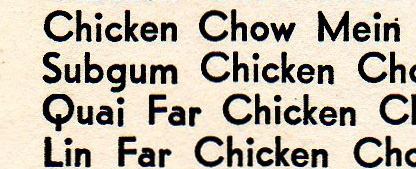
I can't identify this font for the life of me. Help?

It’s Vogue, an old metal face. No digital version as far as I know.

Must have been some variation in sets of the old Vogue. Your specimen resembles Intertype Vogue Bold but has the Q tail in the vertical position of the Extra Bold. Your e and g look like the ones from Kabel. Here is the character set of both weights.
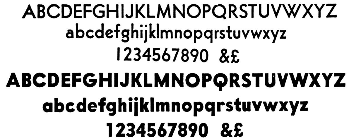
Vogue had alternate characters that enabled it to imitate the look of Futura or Kabel. Your first sample shows Vogue with some of the Kabel-like alternates (the bolder sample has the “Kabel” lowercase t as well). The original poster’s sample shows the standard characters.
Thanks. I transposed some notes.
Don
Captured from web.archive.org on 11 Oct 2013. view this capture