
Any idea what this font is?
| Attachment | Size |
|---|---|
| Bon Appetite font 1.jpeg | 83.02 KB |
Any idea what this font is?
| Attachment | Size |
|---|---|
| Bon Appetite font 1.jpeg | 83.02 KB |

It's an Italianate style, popular in the 1820s and 1830s. I have a version of same, but the uppercase /A/ follows the more traditional layout...

Related:
http://typographica.org/typeface-reviews/karloff/
hhp
Beautiful. Thanks
Don
I'm going to have to pick this up. Thanks a lot for the history too. Been seeing more and more of this in publications.

This is the infamous Italian by Caslon of 1821.
Nick has suggested his version, which is a good one.
Another one is Slab Sheriff by Match and Kerosene, a Western style
interpretation.
Don
There was significant variation in letter-forms for various sizes of Caslon's Italian from the outset:
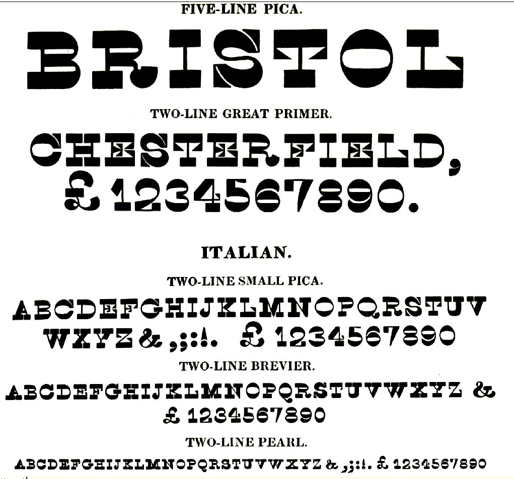
Paul Barnes did an authentic recreation of Caslon's Italian, from the original proofs at the St. Bride Type Museum but as far as I know it was never released.
See his specimen.
Don
One size of Caslon Italian punches from St. Bride, mirrored:
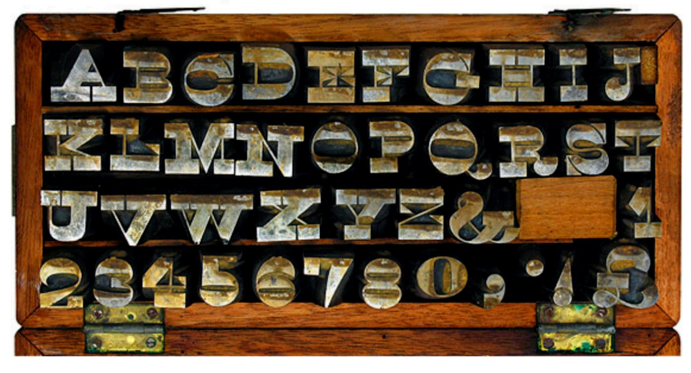
Cool stuff.
hhp
I gathered all this stuff when I was making my own version. Then it dawned on me that that the field was already crowded with versions of this spaghetti western font and I sent my design to boot hill.
Don

Bon Appetit uses typefaces by Commercial Type (Paul Barnes is a co-founder of it), e.g. Isambard and I guess they also use Caslon Italian digitized by him.
Paul Barnes had a list of several early 19th century typefaces -- including Caslon's Italian --that he said were almost ready for release through the St. Bride Type Foundry. It would be interesting to see if they do surface through Commercial Type.
Don
I've long thought that Italian's stroke contrast is too literally inverted - it's like a contrarian, irrational teenager. There must be room for designs with more judicious, purposeful stroke inversion - a mature, collected iconoclast. Ugly doesn't have to be stupid; and smart ugly often ends up redefining beauty.
hhp
Talking about " the field was already crowded", here is a couple more of its interpretations/digitizations: OK Corral and Italian Throwback
Captured from web.archive.org on 14 Jul 2014. view this capture

