
Hello everyone.
Here I am to present you this Riviera, my first attempt to design a font. The project started in the late 2005, when I hand-designed some capital letters to present a project.
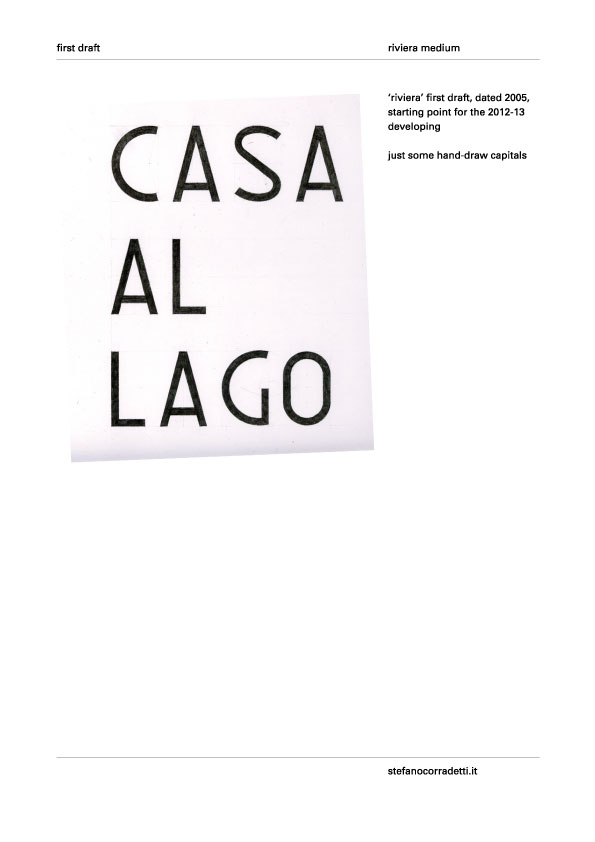
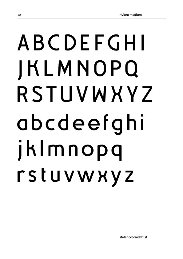
Now I'd like to complete it. In my mind it should be a display font inspired and recalling the modern movement, '50 etc. Until now I designed a to z lower and uppercase. Numbers are just sketched, I need some time to fix the thicknessess; punctuation and glyphs are not yet drafted. Maybe in future I'll develope different weights versions, but now I want to define this medium weight one.
Here there is a little test page:
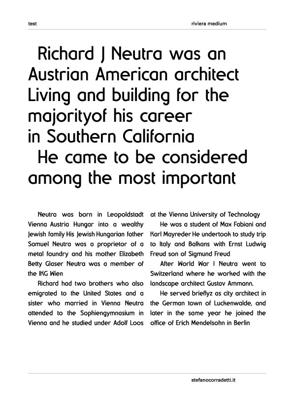
I know there are some problems. /S/ is quite ugly, although /s/ satisfies me more but not at all; /r/ is not so good, the cut seems sharp; and many more things that probably now I can't see. Expecially I'd like to ask you an opinion about the general rythm and the relation between letter width. I think there's something that doesn't work but I can't understand what.
Thank you in advance
Best regards
Stefano
Pdf is attached to take a closer look
| Attachment | Size |
|---|---|
| 13-05-29_16-25_RivieraReg.pdf | 303.13 KB |


