Hi Typophiles,
I'm still a student, so my education in type-design still has some large holes, forgive me if the question is very obvious. Was wondering if anyone tell me why these numbers are different? Am I right in thinking that the glyphs in the 1st are typical neo-grotesque while the 2nd glyphs are based around more geometric forms?
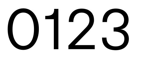
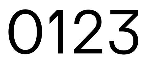
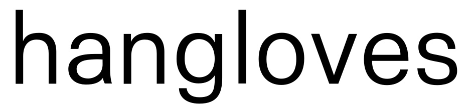
Is it ever appropriate to match the numbers within the 2nd image with neo-grotesque letters? See sample below.
Any advice is appreciated,
Seb