
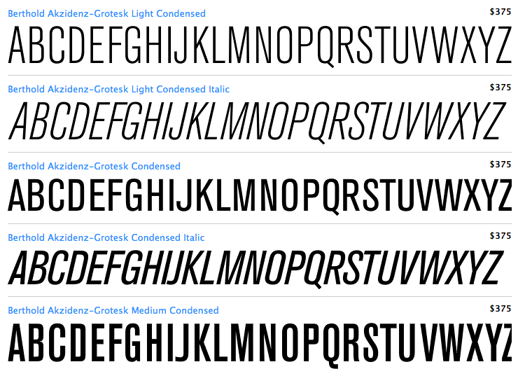
After almost seven years of putting it off the time has finally come to assemble a portfolio and stationary etc. Over the last few months I've been looking at a number of typefaces to use for 'branding' myself so to speak and have almost certainly settled on Akzidenz Grotesk Condensed Light and Regular.
The things I love –
- The inconsistencies between weights – between light/regular and medium upwards, some of the characters change completely (B, J, K, Q, R at first glance)
- For a personal project it's pretty expensive (You can't buy individual weights).
The things I do not love –
With this in mind, I just want to make sure I'm not overlooking any alternatives. I've looked at Tungsten and Knockout from H+FJ, Univers Condensed, DIN, Trump Gothic by Canada Type – all of which have some aspects that I love, but there is usually something I really don't like also.
Any suggestions?
| Attachment | Size |
|---|---|
| akzidenz.png | 98.71 KB |


