
Can anyone help id this beautiful font? Have a feeling its very contemporary, or its a heavily altered classic.
Cheers,
Seb
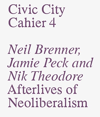
Can anyone help id this beautiful font? Have a feeling its very contemporary, or its a heavily altered classic.
Cheers,
Seb

Don't know this one but looks like they started from Times.

Indeed.
Look how they did little to the difficult letters (like the "s", which is too light) resulting in a clumsy whole.
hhp
Really? I wonder then if they intended it to look clumsy? I rather like it myself. This is a publication from Bedford Press, which has close ties to Radim Peško, who I think designed this. He has a very interesting style and isn't afraid to buck trends:
http://www.radimpesko.com/fonts/larish-neue
http://www.radimpesko.com/fonts/f-grotesk
Agree. Saw also the connection with Radim Peško and was actually my very first thought. Try sending an email to him, he might answer.

“He has a very interesting style and isn't afraid to buck trends”
Dude. Look (really look) at the lowercase ‘g’ in Larish Neue. Why bother?
Buck trends? Looking stupid is the trend!
hhp
I'm looking man. It was one of the first things I saw. I appreciate it because I find it interesting when someone like Pesko decides to put some ugly/character into his work, especially in todays context where 'perfect' curves and proportions are achievable. It kind've draws some parallels with old specimens, where 'imperfections' were often due to technological issues i.e paper quality. Pesko's moves these into a stylistic area. Which I'm not opposed to. But it's ok if you are! :)
Maybe trends was the wrong word, convention more like.

Radim definitely didn't do it and the press is not responding...
Captured from web.archive.org on 19 Apr 2015. view this capture