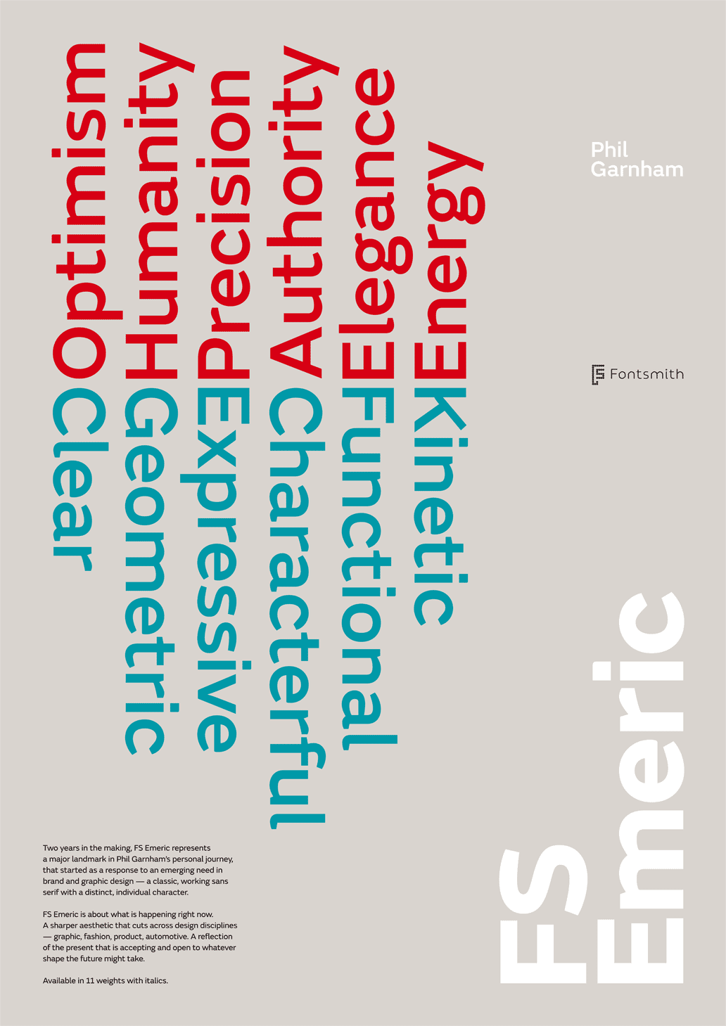
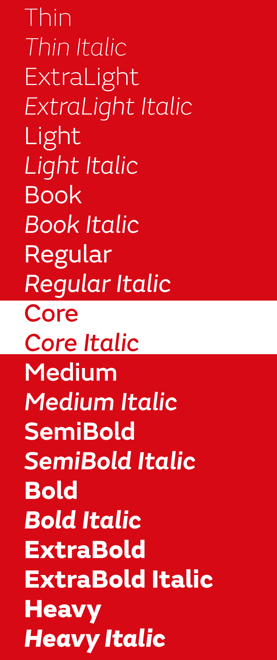
London based FontSmith has released the new sans serif typeface Emeric. It is a strange animal, part humanist sans serif, but with very geometric shapes, and yet not a grotesk.
I have mixed feelings about this typeface.
For one I applaud the fresh approach and the absolutely distinctive and original character. Fontsmith has definitely created something new with its own, unique expression. On the other hand I feel that character has been taken too far in some ways, particularly with the lowercase letter a, which looks a bit like an accident, or the lowercase g, with its squashed lower bow ending, creating a blotched joining between the upper curve of the lower belly.
Many glyphs have the feeling of metal being hammered and bent into shape.
Features like these add to the overall distinction of the font, but they also make it look a bit amateurish. From the marketing and presentation of FontSmith (they asked great design studios to create posters with the new font), I take that amateur is not the impression they want to leave behind.
I cannot say the font looks plain ugly. It does not. It has definitely a certain rugged charm to it, but it laso feels very unharmonic in some ways, and I have the feeling that I’m noticing its imperfections too much to be forgiving, or getting used to read text written in this font. This may change after seeing it applied in various context. Emeric has some architectural touch to it I really like, especially in larger sizes. In smaller sizes I cannot help stumbling over the lowercase g with every line I read.
What do you think?
http://www.fsemeric.com/
http://fontdeck.com/typeface/fsemeric
| Attachment | Size |
|---|---|
| fs-emeric-family.png | 68.56 KB |
| emeric-large.gif | 54.35 KB |