
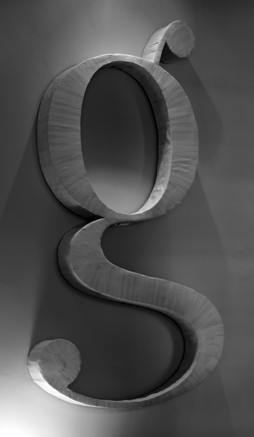

What is it made of, to get that texture...? Masking tape?

Looks that way. What is the primary source for this image?
It's our own work (character design included) thus our image.
It's made using two cardboard g's, front and back. Paper cups give it its height, glued everything together using wood glue. We then wrapped it in torn strips of paper using wallpaper glue.
A day's work if you bored on a sunday :)

The leading, does not it look too tight for you?
[Sorry, could not resist…]
:D

Put it in a sarcophagus!
hhp

I like it; I'm going to make one for myself.

>Put it in a sarcophagus!
Tut Tut! With all these critiques I'm surprised the designer hasn't gone running to mummy.

7414 pt ≈ 100', or 2.5 m? gee ... You can ink wallpaper with this!
BTW where did you get that "g" shape? You might not know that it's quite historic - it looks just like the one in the first font made in the New World, by Binny & Ronaldson (a font formerly known as Oxford, and now known as Monticello).
hhp
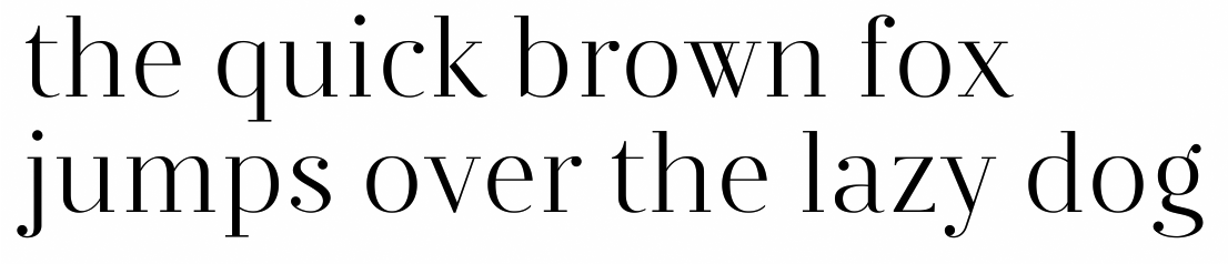
It's from a design I'm working on.
Captured from web.archive.org on 20 Aug 2013. view this capture