Hi there, good people!
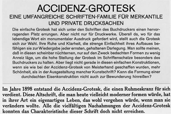
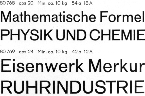
I'm a graphic design student curently working on a type poster about the differences and similarities of Akzidenz Grotesque and Helvetica (I know, not the most original choice). I've browsed through all of my type books and what feels like the whole Internet, and I found a few good article of Helvetica vs. Univers, but the info on Akzindenz is rather shallow and nothing I didn't know from before (Directly influenced, horizontally cut strokes and taller x-height).
I guess what I'm asking is if someone has some interesting information or can point me in the direction of articles that can help make my poster at least a little bit more interesting that the 1000s other out there.
Thanks in advance,
Erik