
hi -- anything come to mind for a font that could work for Racing cars? i have been searching for days, nothing really popping out. the main letter is "S" so something with a curvy quality but bad a**! thanks in advance for any suggestions! :)
hi -- anything come to mind for a font that could work for Racing cars? i have been searching for days, nothing really popping out. the main letter is "S" so something with a curvy quality but bad a**! thanks in advance for any suggestions! :)
Maiola comes to mind: http://www.type-together.com/Maiola
Agressive, stressed, somehow and somewhat unquiet, unpeaceful,... as if saying "Get out of my way!" Not bad for a racing car! Still not convinced? Then look at the italic capitals K, R , X,....!
Still not sold? Then wait for suggestions from the experts!
thanks!

I'm personally not feeling it in Maiola, but it does give me the idea of suggesting this:
http://www.myfonts.com/fonts/type-together/eskapade/fraktur-italic/
Or what about this?
http://www.themicrofoundry.com/other/nour&patria/dev/nour-latin.gif
Although you'd want the Bold.
Or: http://www.myfonts.com/fonts/fw-alias/klute/
But I'm sure better suggestions are on their way.
hhp

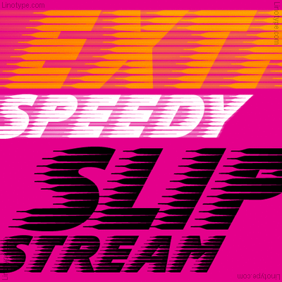
I think I win :P
@adenson: Is this personal, professional, or academic work?
those are interesting ! thanks for making suggestions. :) i am thinking more masculine ... maybe yumi but outlined: http://www.myfonts.com/fonts/positype/yumi/bold-oblique/
@chris -- it's for a friend but they may use it for business.
great font suggestion, chris. thank you!
I was actually half joking! Hilarious. Please post your work if you manage to pull off using Slipstream. I’d love to see it in action. If I’m not mistaken, it is mandatory that every city in the world have at least one courier service which uses this typeface ;)
:) i think we need something a little more cutting edge ... but yeah, i've seen that used a lot
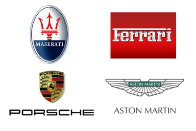
The logos of some car companies known for speed don't necessarily reflect that in their font choices:
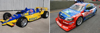
And most real race cars are covered with sponsor logos:
I know this info isn't particularly helpful to you, but just thought I'd point it out.
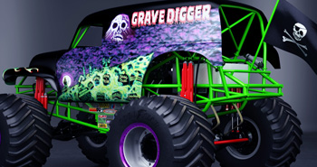
A few weeks ago I took my nephew to a monster truck show and many of those actually had more dramatic (but mostly juvenile) use of graphics and fonts.

Try Dispatch by Cyrus Highsmith.

Typodermic's Hemi Head 426?
pablo, james, renko and té -- thanks so much. i am going to play with these font suggestions and see what he likes. james, good point about performance car companies. i really appreciate the input -- very helpful! some new fonts i hadn't seen ... :)
Captured from web.archive.org on 23 Jan 2015. view this capture


