Typophile

Gryffensee: A geometric sans blackletter

Christian Thalmann

I'm happy to announce that MyFonts released my font family Gryffensee today. It features extensive language support including Cyrillic, and comes with a 25% introductory sale.

http://www.myfonts.com/fonts/catharsis-fonts/gryffensee/
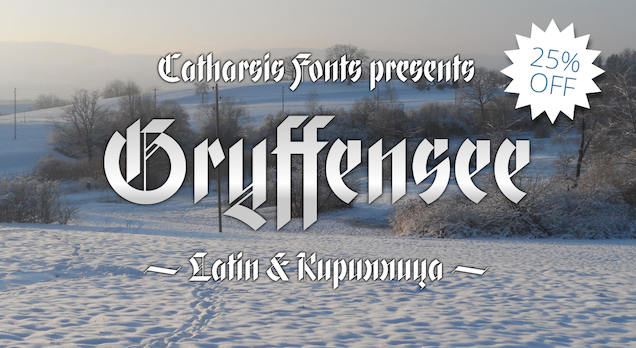
Thanks to everyone who gave me feedback here on Typophile!

Enjoy!

Love that /g/.
Congrats and good luck, Christian.

Thanks, Craig! The {g} showcases the new style of descender that I built just prior to the release. The solid stroke of the descender is steeper and protrudes less to the left, and conversely the thin connecting stroke is now less steep, instead matching the 39° angle of the cuts of the vertical strokes.

Also, I've slightly revamped my marketing material thanks to some comments on the TypeDrawers board, and put them up on Behance: http://www.behance.net/gallery/Gryffensee-a-geometric-blackletter-%28inc... .

I bought a copy!

It evokes so well the expression "crystalline flower" from Bain & Shaw's "Blackletter: Type and National Identity".

hhp

Great work!

Interesting work!
Your two fonts have a very unique personality! :)

Captured from web.archive.org on 14 Apr 2015. view this capture