Typophile

The love child of Sweet Square & Durandal Flat??? o_o

SethFromNZ

Hi All!

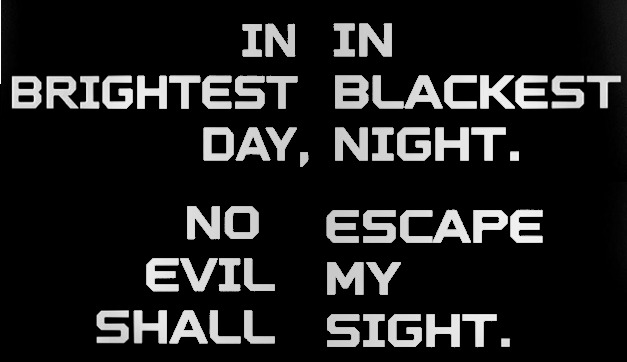
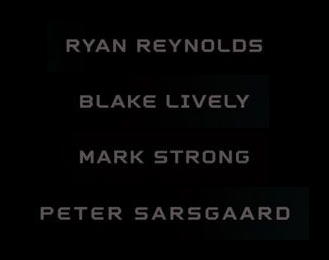
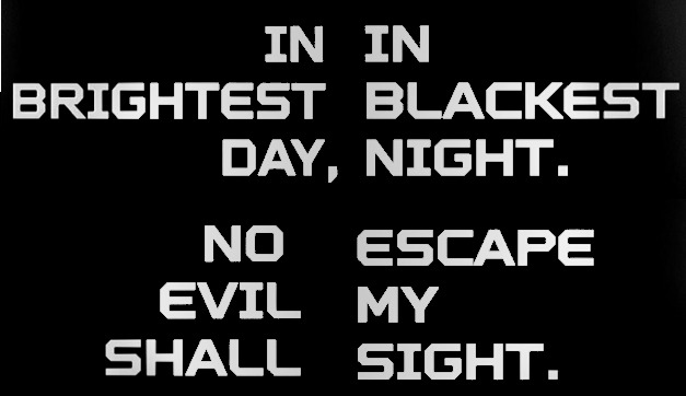
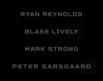
This font is from a series of four teaser posters for the Green Lantern movie (2011), designed by Concept Arts.

FULL POSTERS HERE

Is it just a customised version of "MVB Sweet Square"? The I, E, & K seem quite different. I've found a bunch of similar fonts ("Aerotype Durandal Flat", "Piranha" by Nathan Caldecott, "Identikal Rally", "Identikal Rebirth", "FF Aircraft"), but no exact matches.

Also, how would one classify this font? A "chamfered angular square sans-serif"?

*** Bonus points if anyone can confirm whether the "2011" on the poster is even in the same font? ***

Thanks in advance! :D

AttachmentSize
green_lantern_-_teaser_poster_font_-_1a-(already_on_wtf).png45.22 KB
green_lantern_-_teaser_poster_font_-_2a.png25.01 KB

What I can say is I was not able to identify it either. It also remains unsolved on WhatTheFont Forum. So, 2 possibilities: totally hand-drawn from scratch or customization from an existing typeface (what I prefer, less frustrating ;). Sweet Square is also the closest I've found but some details you've already spotted remain off (but not hard to reproduce). It also shares many similarities with United, KP Duty and Full Block but none of these ones are matching either.

Thanks Ryuk! :)

Any other takers? :)

I'll send over somebody I know who might know.

hhp

Unfortunately Hrant, I worked on a different comic book movie than this one. My completely uninformed guess would be that they took an existing font (like Durandal Flat) and modified it for the movie. But since I didn't work on that one, I can't say for certain. Sorry, wish I could be more help.

Thanks anyway Corey!

hhp

Thanks Hrant! Thanks Corey! :)

It's nice to know everyone else is as stumped as me. ;)

Captured from web.archive.org on 19 Aug 2013. view this capture