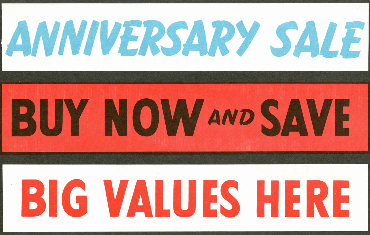
Twentieth Century MT Condensed Extra Bold is close or it.
Similair but not quite, ithe above's a bit quirkier, hasn't got the double decker 'a', the flat edge on the 'G' or the lowercase flicks on the 'l'. Cheers though!
Captured from web.archive.org on 2 Jul 2014. view this capture