
Critiques welcome. Three variants in this release: Regular, Condensed Bold, and Condensed Bold Italic.
Available here:
http://openfontlibrary.org/font/earthbound
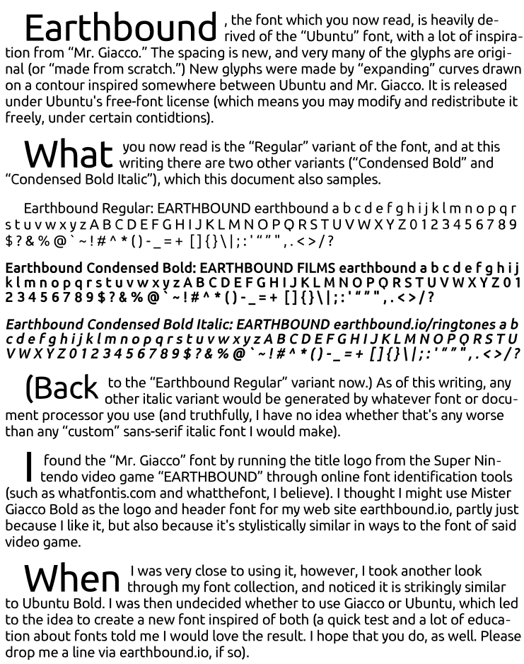
Kinda wondering if it's even condensed enough to call "Condensed."
Thanks!
Critiques welcome. Three variants in this release: Regular, Condensed Bold, and Condensed Bold Italic.
Available here:
http://openfontlibrary.org/font/earthbound
Kinda wondering if it's even condensed enough to call "Condensed."
Thanks!

Condensed? No condensed here.
If you're talking about letter spacing you could say that it's a bit too tight, but not condensed.
But to get a better feel for this font it would help to give it beat more leading as it does have a rather high x-height.
Ok, thx. Maybe a lower x-height would be better . . . and if I stick with that spacing, maybe it would be semi-condensed?
I think I have a new version of this that just needs a few tweaks and then I can upload an update . . .
Captured from web.archive.org on 14 Apr 2015. view this capture