
Is it me or is there a major inconsistency with Old Standard's line spacing? I'm using it via Typekit with many complications in my layout.

Is it me or is there a major inconsistency with Old Standard's line spacing? I'm using it via Typekit with many complications in my layout.
Anyone care to comment on my question?

Line-spacing issues usually involve more than one line of type. Rather, are you asking about the apparent lack of kerning in the font?

What do you mean by 'line spacing'? That normally suggests interline spacing, i.e. leading, but your illustration shows only one line of text, so perhaps people are too confused to respond?
Okay so perhaps my terminology is incorrect. My apologies. I'm specifically speaking about the difference of the gaps between the very top where the blue starts and the cap-height compared to the baseline and where the blue ends (see red arrows).


Most capitals won't sit vertically centered in their space because that space is set up to accommodate descenders of the lowercase (and potentially Q and J). Maybe that accounts for what you're seeing.
That's what I initially figured. It's just incredibly difficult to set a line-height and it output equivalent space above and below. I was hoping to not have to result to padding or margins.

Related: http://typophile.com/node/9482
hhp

The variation in the distance that is displayed may also come from counters that extend below the baseline and above the capital height.
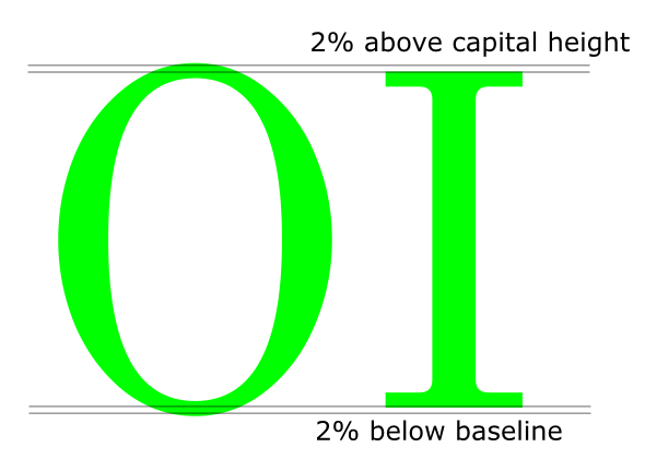
Really appreciate the help, guys.

I was hoping to not have to result to padding or margins.
You could try using a {vertical-align: -6%;} attribute to baseline shift. Not sure if this is more desirable than adding padding-top.

After God finished designers, he (she?) was heard to mutter "Another half-baked idea. Now I've got to make typesetters, or nothing will ever get done."
You could try using a {vertical-align: -6%;}
Ah. I wasn't aware if you could use the vertical-align property on block-level elements.
After God finished designers
God?
God?
It's a feel-good explanation. If you use a Darwin-based model, designers would be just another failed mutation.
Captured from web.archive.org on 25 Aug 2013. view this capture