
What are the differences between Droid and Open Sans? All details on any aspect welcome.
hhp
What are the differences between Droid and Open Sans? All details on any aspect welcome.
hhp

Open Sans is slightly wider and has a modified I and Q.
Nothing else?
Are they essentially the same typeface, with minor tweaks?
hhp

To my eye it doesn't feel like it. They are alike in a lot of details, perhaps more than warranted, and definitely hovers on the borderline, but to me it's less of a case than classics like Helvetica/Arial and Frutiger/Myriad. I mean, even such a construction-intrinsic factor as contrast is different.
That of course does not exclude the possibility that one (in the spirit of open source) has borrowed and modified outlines from the other. Open Sans does feel more polished, with better proportions and more even color and application of ideas.

[to follow]
They're both libre fonts, by the same designer.
hhp
Short version, probably answered elsewhere, what, if any, is the difference between “Free” and “Libre?”

Free:
- Free fonts are generally free in price only (as in free beer) but you are not allowed to make modifications, derivatives, etc.
- Some free fonts are free for personal use only, but not for commercial use.
- The source files are usually not shared.
Libre:
- Libre fonts are free in price too. But they also allow and encourage modifications, derivatives, etc.
- Commercial use is allowed.
- The source files are usually shared, so modifications are easier to make.
Two additions:
- Some non-libre (free or not) fonts do allow "internal" modification, which can even be outsourced (as long as all parties own a license). Good examples are Adobe and Monokrom.
- Some libre fonts allow you to resell them (even without packaging them in a broader product).
hhp

I don't understand the point of this discussion. Both fonts were designed by Steve Matteson, no?
Something more interesting would be to see if additional weights or language coverage might have put additional constraints on existing glyphs. When fonts need such modifications, is it not the norm to give a new name? (though it may be less important for web fonts than for text fonts)
I'm just wondering which one is better in what ways. Plus it would be nice to find out their relative ages and differing reasons for being made available. To me they seem close enough to deserve the same name, but there must be something I'm missing.
hhp
Libre = Open-source?
One of these days I'll get this straight. Just not a Monday after a brutal weekend.
And no matter how smart you are, even if you are an experienced player, turning Go into a drinking game is not a good idea. Trust me.
There it gets pretty blurry, but I guess the difference between libre and open-source is that the latter assumes that all the tools to make the font are also libre. For example I've heard people state that Source Sans isn't open-source because some of the tools necessary to have made it are proprietary.
hhp

Michel Boyer, I agree. I don't understand the point of this discussion either.
Seems like simple honest questions to me.

The biggest difference I see in letter design is the tail of the Q. Since Droid is a little heavier and condensed it does feel a little more mono-spaced, even though it isn't.
From the wiki on the Droid fonts, I realize that they have a very wide language coverage. The wiki on Open Sans mentions that the design is almost identical to that of Droid Sans, with wider characters and the inclusion of italic variants. Also "Whereas Droid Sans is used primarily in the user interfaces of some Android phones, Open Sans is used in some of Google's web pages as well as their print and web advertisements."
Thank you, Mich[a]el. :-)
I'm guessing Open Sans is actually even better for small screens (mobile devices). It also has many more weights. On the other hand Droid has a powerful sister (the serif). And does it have more language coverage?
I wonder if there are situations where one would use both.
hhp
Oh, they're by the same designer? Explains a lot of the similary then. But if you're really interested in the differences, how difficult would it be to knock up something like this in Photoshop in ten minutes? ;)
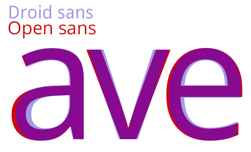
Lots of small curve changes. Plus Open Sans is slightly lighter, has slightly smaller contrast between thick and thins, and seems to fix some of the annoyances of Droid's. And has an extended-latin character set, an italic and many more weights. :)
Droid was made to work on mobile device, wasn't it? I'm not sure what the reason for Open Sans is.
Johan, Photoshop is a great tool, but it doesn't synthesize thought... yet. :-)
The difference in the trapping of the "v" is quite interesting. Droid uses a much more organic form.
hhp

Both see extensive usage as webfonts and in this capacity they look noticeably different, especially in smaller sizes. Open Sans generally looks and feels lighter and more squarish in glyph shape compared to Droid Sans that looks heavier and narrower. Again, this is in smaller sizes (up to 18px) and on screen.
Great input - thanks. And which one is better for headlines?
BTW, Open Sans seems to be 4 times more popular. Is it older?
hhp
Sorry, can't comment on headlines. The only one I used was Open Sans Condensed Bold (example) and it looks great only in all caps and up to a certain size. Obviously a subjective opinion, so take it as such.
Open Sans is less finicky when it comes to getting it render well as a webfont kit. You can basically get a .ttf, feed it into the FontSquirrel generator and the kit that comes out will just work. If you do the same with Droid Sans, it will render substantially worse in smaller sizes compared to the version hosted on Google Fonts. This sort of "finicky".
Priceless - thank you.
hhp

No, Droid Sans was done first, then Open Sans.

For clarification: Droid was first - for Android. Then some folks at Google wanted to extend the style of Droid Sans to help support the corporate brand - however Droid was intentionally made rather narrow for mobile. So OpenSans was made wider, styles were added for branding purposes, yada yada. Naming was all Google's choice, as was Droid Sans being replaced by Roboto in subsequent versions of Android. Hope that settles it :-)
-Steve
Steve, thanks for dropping by, and the "inside info". One remaining question in my mind: what about language coverage?
BTW, I'm almost afraid to ask this tangential question, but since you're here the temptation is too great: why Apache and not OFL?
hhp
Google owns the data - it was work for hire. They determine license terms.
As far as language coverage: LatinA, Greek, Cyrillic, Viet. You may all be further confused by the re-naming of OpenSans to Noto in Google web fonts. Again not my decision.
steve
Cool - thanks Steve.
hhp
Looking at Noto regular, it seems to be just a little bit bolder (14 units in a 2048 UPM) than OpenSans. Has a extended charset (2410 vs 938) and also 'mark', 'mkmk' and 'ccmp' OT features. But discarded the other as 'salt', 'ssXX', 'onum', 'pmun', etc..
Hmmm, there are a number of things that make me think Noto is actually derived from Droid. Is that false?
BTW, great to see that Google still believes in Apache.
hhp

What i like about Noto is that it has a true italic for the Sans branch too, not only for Serif.

Since Google renamed Open Sans to Noto, why would they keep Open Sans up in the library?
Also, why is Noto only listed with 4 styles and not the full 10 as Open Sans is listed with?
[nothing]

It might be because Noto has only four fonts: Regular, Italic, Bold and Bold Italic.
It might be because Noto has only four fonts: Regular, Italic, Bold and Bold Italic.
Okay but if Open Sans is Noto Sans, why don't they have equal sets?
Does open sans cover as many languages as Noto sans? Here are the font I just downloaded from http://code.google.com/p/noto/
NotoSans             Bold, BoldItalic, Italic, Regular
NotoSansArmenian     Bold, Regular
NotoSansDevanagari   Bold, Regular
NotoSansDevanagariUI Bold, Regular
NotoSansEthiopic     Bold, Regular
NotoSansGeorgian     Bold, Regular
NotoSansHebrew       Bold, Regular
NotoSansKhmer        Bold, Regular
NotoSansKhmerUI      Bold, Regular
NotoSansLao          Bold, Regular
NotoSansLaoUI        Bold, Regular
NotoSansTamil        Bold, Regular
NotoSansTamilUI      Bold, Regular
NotoSansThai         Bold, Regular
NotoSansThaiUI       Bold, Regular
NotoSansUI           Bold, BoldItalic, Italic, Regular
NotoSerif            Bold, BoldItalic, Italic, Regular
NotoSerifArmenian    Bold, Regular
NotoSerifGeorgian    Bold, Regular
NotoSerifLao         Bold, Regular
NotoSerifThai        Bold, Regular
If not, maybe Noto sans is not open sans.
All things seem to point to Noto coming from Droid.
hhp
All things seem to point to Noto coming from Droid.
From what I've watched and read, Google commissioned Steve to create Droid for mobile. Since Droid was narrow, Google commissioned a wider family based on Droid which lead to Open Sans. And from what Steve mentioned above, Noto Sans is just a renaming of Open Sans. But yes, it seems so.
But my question is, why is Noto and Open Sans broken into two and why are there less weights and styles in the library between the two?
Maybe there are unreleased styles of Open Sans?
But does Noto have more language coverage than Open Sans?
hhp
Oh, sorry, I had forgotten to download the Noto unhinted fonts. Here is the list
NotoSansAvestan                Regular
NotoSansBengali                Bold, Regular
NotoSansBengaliUI              Bold, Regular
NotoSansCarian                 Regular
NotoSansCherokee               Regular
NotoSansCoptic                 Regular
NotoSansDeseret                Regular
NotoSansEgyptianHieroglyphs    Regular
NotoSansGlagolitic             Regular
NotoSansImperialAramaic        Regular
NotoSansKannada                Bold, Regular
NotoSansKannadaUI              Bold, Regular
NotoSansKayahLi                Regular
NotoSansKhmer                  Bold, Regular
NotoSansKhmerUI                Bold, Regular
NotoSansLao                    Bold, Regular
NotoSansLaoUI                  Bold, Regular
NotoSansLisu                   Regular
NotoSansLycian                 Regular
NotoSansLydian                 Regular
NotoSansMalayalam              Bold, (regular)
NotoSansMalayalamUI            Bold, (regular)
NotoSansMeeteiMayek            Regular
NotoSansNKo                    Regular
NotoSansOldSouthArabian        Regular
NotoSansOldTurkic              Regular
NotoSansOsmanya                Regular
NotoSansPhoenician             Regular
NotoSansShavian                Regular
NotoSansSymbols                Regular
NotoSansTagalog                Regular
NotoSansTaiTham                Regular
NotoSansTelugu                 Bold, Regular
NotoSansTeluguUI               Bold, Regular
NotoSansUgaritic               Regular
NotoSansVai                    Regular
NotoSerifLao                   Bold, Regular
I added (regular) for those fonts whose filename does not contain "regular". Of course, that list was generated with a script, except for those "(regular)".
On my box (WinXP Pro with ClearType on), Noto Sans comes across as slightly heavier than Open Sans, at least in the Regular weights. Also, Open has a two-story 'g', Noto a single-story one. Other than that, they are almost twins. But then, Open comes from Ascender and Noto from Monotype... and who again bought Ascender?
However, as far as I can see, Noto Serif is twins with Droid Serif.
A rose by any other name...
It's all from Matteson.
hhp

Quickly:
Okay but if Open Sans is Noto Sans, why don't they have equal sets?
They are not the same. They look pretty similar where they have common glyphs, but as Impallari said, even those glyphs are not 1:1.
I think of it this way:
Open Sans is a 'print' family, useful for web and print; 9 weights of normal width plus some condensed styles. It covers euro+viet latin, cyrillic and greek.
Noto is a 'screen' family made to avoid the 'no font on this system can display that unicode character' problem. It has 1, 2 or 4 styles per script, has fonts to cover all of Unicode.
Noto covers all of Unicode?
hhp
It will do, according to https://code.google.com/p/noto - "fonts that support all languages in Unicode" -
Captured from web.archive.org on 16 Mar 2015. view this capture