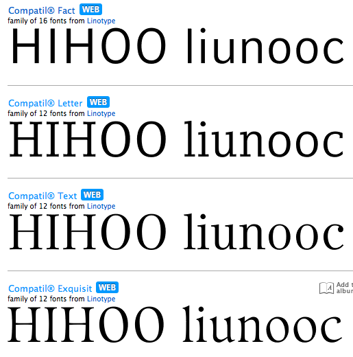
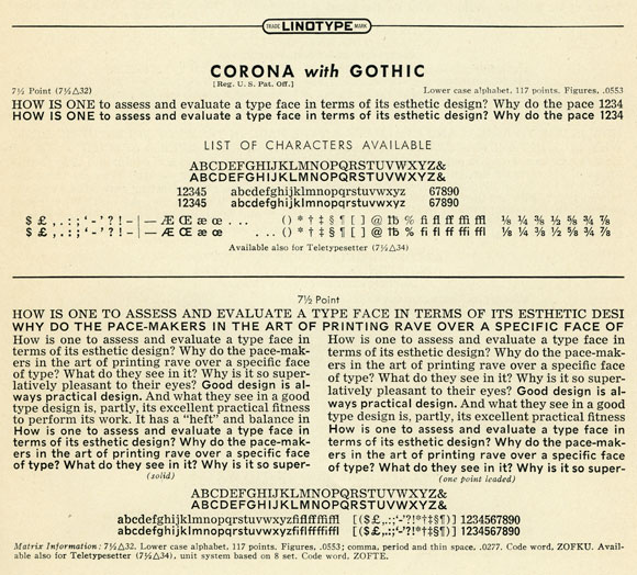
Are any two fonts (that are NOT monospaced) known to be matched in terms of the width of every glyph? I mean one that is serif, and the other is sans-serif.
My goal is not to pair or match fonts for aesthetics and use them together, but to find two that are interchangeable without having a single glyph need more or less space. If I need to purchase fonts, realize I'm on a schoolteacher budget but the investment would be worth it.
Here's my situation: When I introduce students to a printed material (yes, the dreaded "worksheet"), it's often helpful to display and review the entire thing on an overhead digital projector. For the print version, I believe serif is the most readable and looks nicer. For the display board, with some students straining to see from the back of the room, going with a simpler, more screen-readable sans serif would be ideal. Yet to throw off the line spacing (and therefore pagination) causes other woes. Right now the only reliable solution I have is to use hard returns and keep each line safely short of the margin.
If my basic idea is flawed, stop me here and tell me to go home. I apologize also if this question has already been answered. My lack of technical vocabulary in this area makes typing search strings a bit futile.
Joseph Woodard