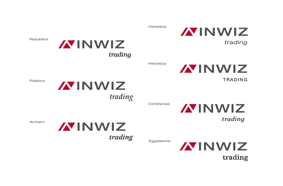
Typo/composition critique wanted :)
Please share your opinion.
Logo is chosen (investment consultancy), now I just need to get the word (trading) right. It was added at the last moment.
The guys want the word trading to be placed aligned below the main word, but I feel it can breathe more if it s pushed further right. They are also quite conservative about the font (trading). Do you think it s fine If I just stick with another Helvetica for trading? I have to admit I am still learning about typo, so don t know what to fight for. Still my instinct says, it s a bit boring to have both words in Helvetica :)
Btw. what do you think of the colour? They wanted red although it s not v common in investments. I feel that at least it s distinguishing them from the competition (theya re all blue or green).
Thanx for your opinions!
K.