
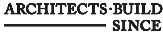
any ideas? the top of the A is a little unusual...
any ideas? the top of the A is a little unusual...
actually - this may give you a more accurate picture. it's not the bold version.


I think this might be Adobe Caslon Bold Oldstyle with added stroke. It tends to blunt the serifs and make it look 'slabby', but the shapes seem about right to me.
- Mike Yanega
i think you may be right mike - thanks!
Captured from web.archive.org on 15 Oct 2013. view this capture