
Filed under Logos although this is UI/UX because the final output must visually represent an exact statement.
We are working on a mobile app for Android.
The aim is to inspire the user to discover and express himself through a visual interesting and complex emotional statement.
The user creates a badge saved as a jpeg that he can share to any network.
Concerning the User Interface it all starts with choosing a Smiley to convey a basic emotion.
The complexity of the emotional statement arises from following layers which are not part of this topic.
I attach three different versions.
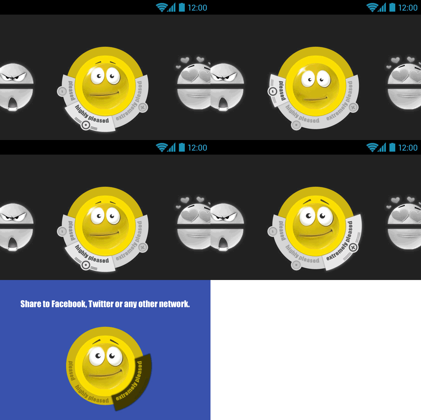
Generally, by swiping the Smiley-parts at the sides of the screen the user is able to change the basic emotion as seen in version 1.
But what we are actually concerned with is a quantification or refinement of the Smiley.
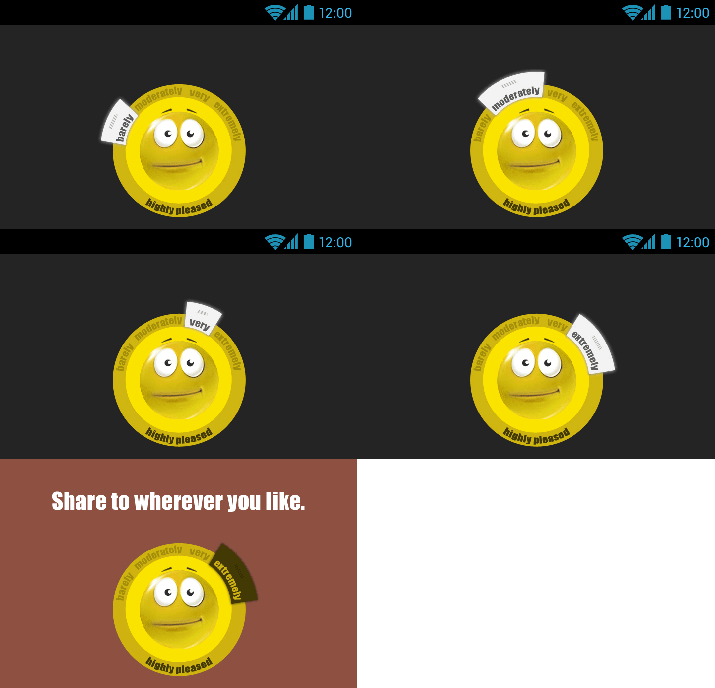
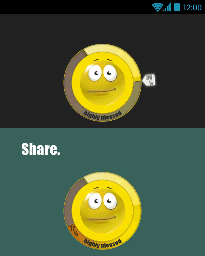
This is especially difficult because of integration of typography. Every Smiley is named different and each version of refinement is needing a visually pleasing and functioning positioning of either other Smiley name tags (version 1) or adjectives (version 2) or visually represented quantification (version 3 through a circle scale).
Version1:
To refine the mood means to alter the Smiley and its name tag itself. The user is able to either weak (-) or boost (+) it.
For the second and third version a quantification of the Smiley will be visually expressed apart from the Smiley.
The second version tries to achieve this effect by adjectives and the third version by a percentage circle scale.
All in all the interaction must be straight-forward to use and the shared jpeg easy to read. We "audience" that would read the shared jpeg understands the Smiley as chosen and quantified and therefore deeply personal.
I attached gifs to convey interactivity.
Which approach do you like more?
Is anything concerning the position of typography or genereal design unpleasant?
Feedback is very much appreciated,
Many thanks
1
2
3
| Attachment | Size |
|---|---|
| gif_1.gif | 130.9 KB |
| gif_2.gif | 63.17 KB |
| gif_3.gif | 59.54 KB |


