Hey guys,
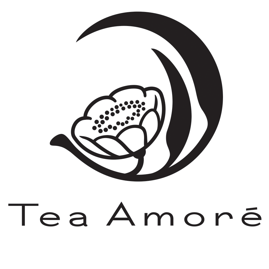
this is my very first attempt at a fully custom logotype. any feedback on the typeface would be awesome.
the client is looking for something "fresh, adaptable, and clean" ; I feel a wide-set humanist sans-serif balances well with the classical themes evoked by the graphics floral theme and circular shape (based on a Kamon), but with no formal training in type design, only a ferocious interest, I want to to my best to ensure that it can stand up to the critical eyes of the most well trained type-designers, and so I arrive here.
My major concerns lie with the 'm' 'o' and 'r': specifically, the join at the center of the 'm', the "angle" of the 'o' and the terminal angle of the 'r'
| Attachment | Size |
|---|---|
| TeaAmoreLogo.png | 139.57 KB |