Typophile

Deconstructing serifs on broad-nib based typefaces

Wade Jenson

I'm breaking down typefaces to try understand their construction — brush strokes, direction, angle etc (manual Kalliculator you could say). Currently I'm looking at broad-nib based typefaces, and I'm hoping someone could shed some light on their design and construction with regards to serifs.


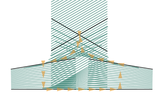
This is what I think it may be: the white lines being the 'brush', starting at 30 degrees
and arrows the direction it travels — are these serifs shapes constructed without regard to the brush or do they follow it some how?

Another example is Dolly, where the serif is asymmetric and I've no idea how that's drawn,

Thanks

AttachmentSize
dolly.png6.75 KB
serif.png119.92 KB

Correction, with Dolly, I can imagine it being the same but with its core stroke curved to follow the asymmetric outlines — however I've no idea why it would be this way… whether it's the product of another method of construction I don't know about or style (as in stylised away from original brush constructed serifs) Reading Noordzij didn't clarify this either!

This is only useful for understanding the mistakes of the past. Not even the most devout disciples of Gerrit Noordzij follow chirography that closely. Most of all, I would be very sad to see you apply these approaches to the highly promising area of parametric fonts*; you'd be killing your relevance to the future of type design. Sorry for the harsh reality-check.

* http://typophile.com/node/101044

hhp

hrant, I'm absolutely aware of the limiation of Noordzij's models, I'm only trying to break these down for educational purposes–no intention to build these into the future of type design.

In Fr Catich's The origin of the serif there is a nice illustration of how symetrical serifs are made with a broad brush. It involves two strokes, the first integrated with the vertical stem, the second overlaid:

This is pretty much the model for most typrographical serif constructions. Obviously asymetrical serifs, as illustrated by Dolly, seem to be a fairly recent design trend.


The top right serif here (Goudy Old Style) is quite interesting.
The stroke moves across the top stem steadily, then begins to rotate counter-clockwise as it approaches serif position.
The coup de grace occurs as the right side of the nib is lifted off the paper and the left corner is dragged straight down.

You can see some of the «tricks» the old masters employed in this demonstration film by Hermann Zapf:

Pressure and rotating of the nib are show starting at 9:00.

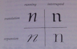
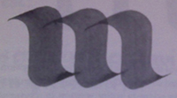
Thanks for your responses, Do you think the asymmetrical serif is a result of stylising the broad nip brush stroke? A friend showed me these passages from The Stroke:


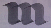
The difference between the returning construction of 6.5 and the interrupted construction of 6.6 is not visible in the shape of the letter.
6.5
6.6
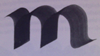
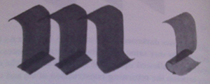
When the interrupted construction is adopted the letter can acquire feet accentuating the ends of the strokes but the feet are details from which no hasty conclusions can be drawn (figure 6.6). This is the prototype of textura. If this letter were to be made narrower, the difference between the curves and the feet would become too small (figure 6.7).
6.7
The letter is no longer recognizable as an m. This can be remedied with a backstroke in the feet (figure 6.8). This is the endpoint of the blackening of the textura…
6.8
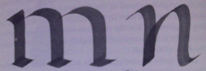
…The humanistic cursive is a cursive with a small counterpoint (figure 6.13)
6.12 & 6.13
and the roman has all the characteristics of the textura but for the heavy stroke (figure 6.12). After 400 years we have become accustomed to roman type, but we might yet do well to marvel at the fact that the reversal in the textura foot has been so emphatically adopted, and for no other reason than the prestige of mediaeval western civilisation…

I can see how the asymmetrical serif might derive from the brush stroke then stylised to look like the construction John Hudson posted.

Indeed, but I think you're looking so deep that you're missing the obvious, that a broadnib pen can be held at any angle, people like to experiment, and so forth. Somebody tried something different, and found liked the results.

Actually, the reason we have serifs is because the Romans used them, especially in stone -- serifs, especially symmetrical, make vertical and horizontal strokes look formal and regular, and the Romans liked their effect. Symmetrical serifs also look like the plinths and whatnot that join columns to buildings. Another factor is that they used to paint their letters onto stone as a guideline for sculptors to chisel, and switched from round to flat brushes early on. Or that it was the official Imperial style: formal, regular, somewhat elaborate, time-consuming, and expensive. So really, it's as much a matter of taste as of technology, much as it is in any style of writing.

As for asymmetry of serifs, Mssrs. Jensen and Griffo beg to differ. ;^) But yes, monotonous symmetry has been the mainstream trend for a very long time; it just looks more formal.

If you're interested in the genesis and history of the serif, do read Catich.

hhp

Alas, "interested" and "rich" are not necessarily correlated: $140 for a used copy... eep!

Libraries rule! Especially ones that do what's called an ILL for you.

hhp

Which expands to Inter-Library Loan, if I remember correctly, where your local library borrows a book for you from a distant library.

Captured from web.archive.org on 19 Aug 2013. view this capture