Typophile

ARTHUR – the new Art Deco fonts released

Andreas Stötzner

.

I hereby take the pleasure to announce the release of my new ARTHUR font series.
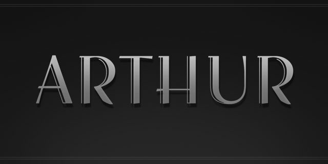
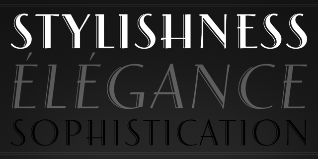
It was obviously inspired by the elegance and sophistication
of the Art Deco era …
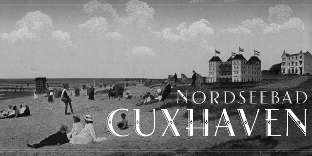
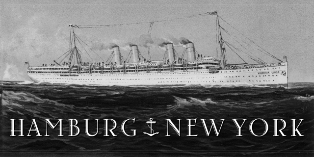
… the classical age of travel and of the dawn of modern globalization.
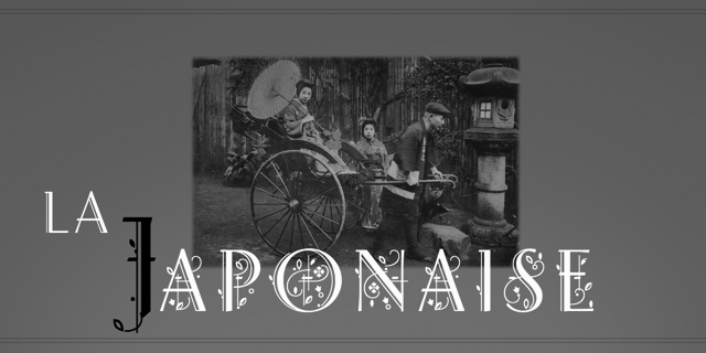
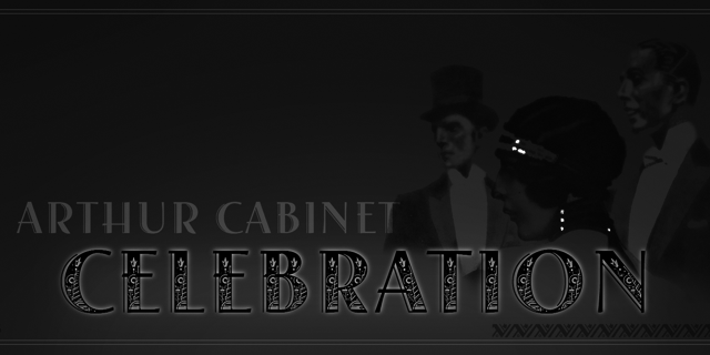
There are two seperate sets of fonts: Arthur Sans (in 5 weights) and Arthur Cabinet.
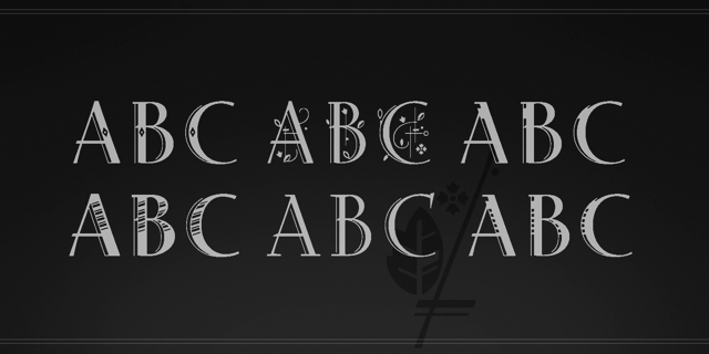
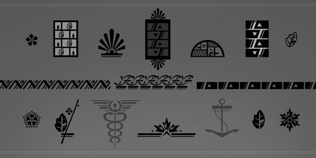
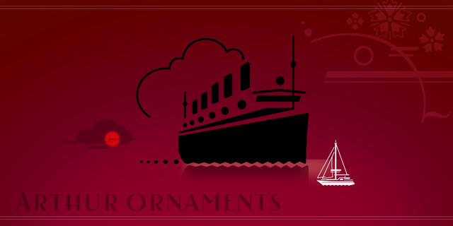
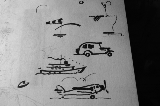
Additionally, a seperate font, Arthur Ornaments, is available:
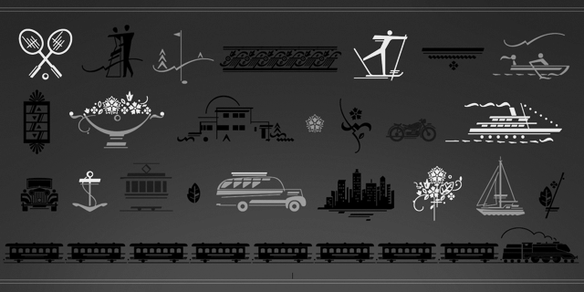

… offering about 70 glyphs with florals, borderpieces, travel, sports and lifestyle pics.
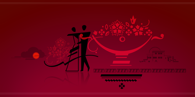
Thank you all typophiles who favourably commented on the drafts during the last two months.

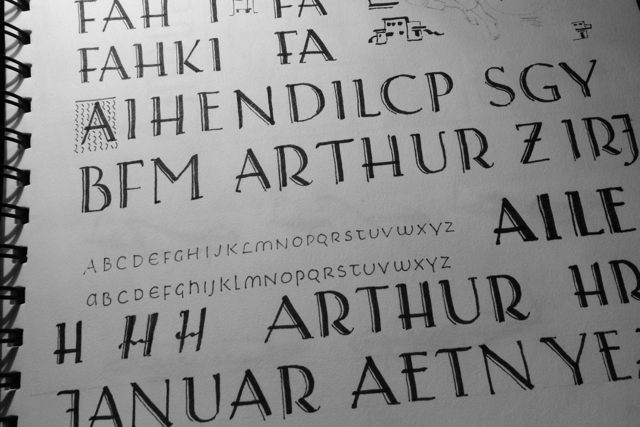
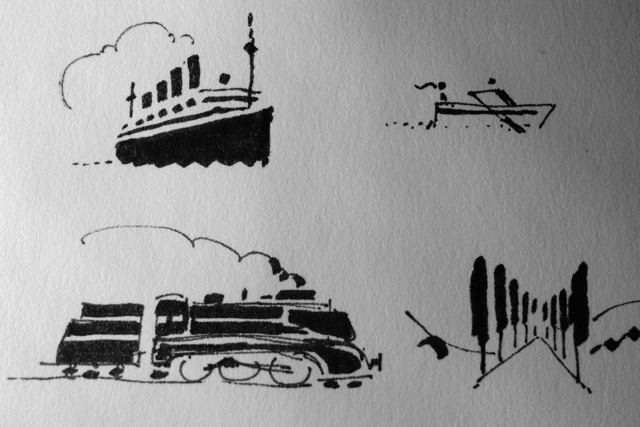
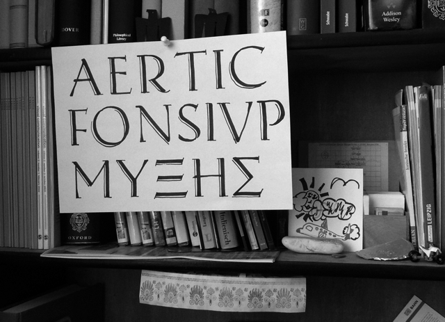
Finally, a glimpse on some preceding sketches.
I hope you enjoy it.


Very nice. It has all the attributes listed in your first sample: Stylishness, elegance, sophistication.

Seeing your work in progress made me wonder about a Sketch weight, with some of the rougher charm of your drawings.

Nice work. Congrats and good luck!

Congratulations! It turned out great! I love the |S|, it's reminiscent of a script-style |s|. :)

Thanks very much, folks.

> … about a Sketch weight, with some of the rougher charm of your drawings.

Well, yes. This could be another option, certainly. Not sure though how well this would work for the entire scope of such a font …
I particularily enjoyed making the doodles. Many of them had been sketched initially.

-applause-

I really like your ornaments. Beautiful work!

However, the Great Eastern (1858) was the only ocean liner to have five funnels :-)

> the Great Eastern (1858) was the only ocean liner to have five funnels

I should have put six on it. I knew it before …

post scriptum: here is an article about Arthur in German.

Captured from web.archive.org on 14 Apr 2015. view this capture