
when choosing a typeface for body copy, do you check certain glyphs against each other, as a matter of habit? e.g. "iIl1 0O".
when choosing a typeface for body copy, do you check certain glyphs against each other, as a matter of habit? e.g. "iIl1 0O".

It depends on the content of the copy.

Only if the nature of the work would cause confusion among similar letterforms. In fiction, for example, the context usually makes things clear, with no confusion. Technical writing, or anything that contains non-words or mixed numbers and letters, requires such concern.
i see. that's very clear.
here's gill sans.
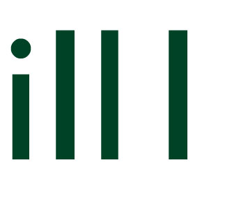
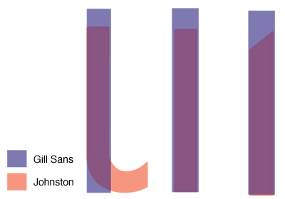
johnston had a foot serif on the "l". which gets me thinking, what's the idea behind creating letterforms that are so similar? it seems like a terrible idea on the face of it (excuse the pun).
Many typewriters didn't have a numeral 'one' or an exclamation mark. You used the lower case "L" for one, and and apostrophe-backspace-period for an exclamation mark. Zero-Oh is an ongoing problem, as are all ambiguities for keyboarding programming languages, where the difference between the right and wrong character is the difference between success and failure. But as stated before, in plain text the ambiguities are usually self-evident from the context, and the type designers don't have to downplay their aesthetics.
But overall, you're absolutely right. It's a stupid idea to have different characters have the same glyphs!

Yes,
but let's remember that's a very old story - the originally "dotless small letter i" got it's dot just to make a difference in between "small letter ms & ns". Life is ambiguous! Or not…
I l and 1 end up looking very similar in many sans serif types because the designer is looking for a particular clean aesthetic in the appearance of text, which is disrupted by the introduction of features that would differentiate these letters, such as putting a tail on the l or bars on the I. [BTW, I've come to the conclusion that the latter is entirely legitimate in a sans serif design, and the bars do not consitute serifs: the barred form of I is an ancient variant of this letter found in many forms of writing independent of the presence or absence of serifs.]

for signage, yes I do. and also narrow apertures that could cause 'a' 'c' and 'e' to be confusable with 'o'.
Otherwise, the ambiguity hardly ever matters in the context of actual words.

I agree your all points. I have received a lot of information about checking ambiguous glyphs. I am provide you huge collection of cool checks designs. By having cool personal checks you are telling the world that you have a great sense of style and creativity. read more
Captured from web.archive.org on 21 Aug 2013. view this capture