Hi,
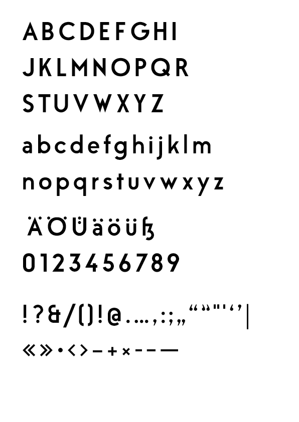
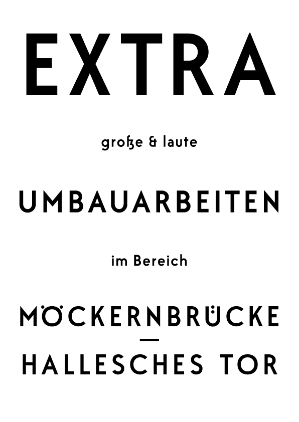
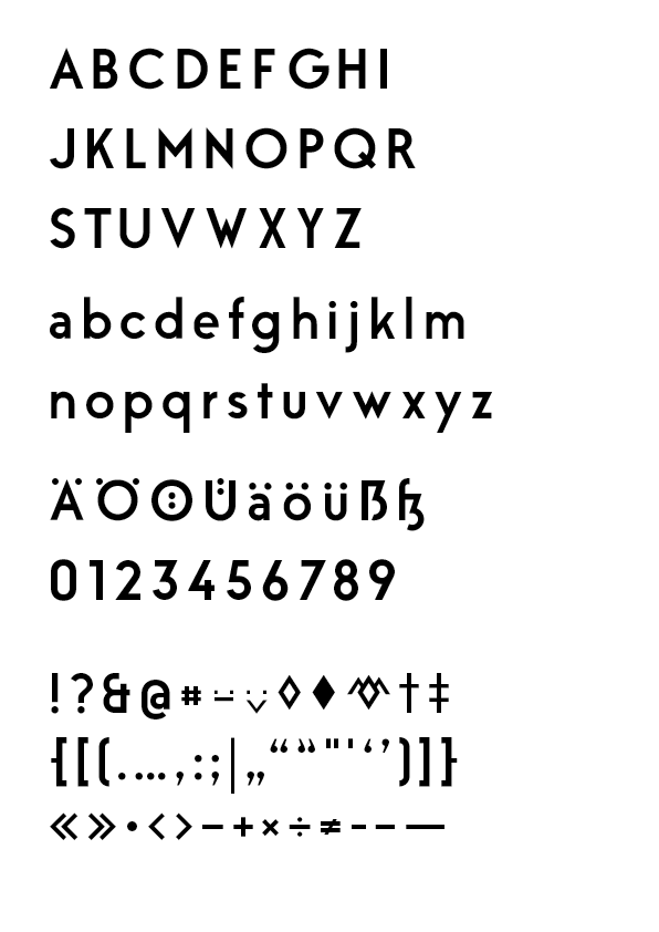
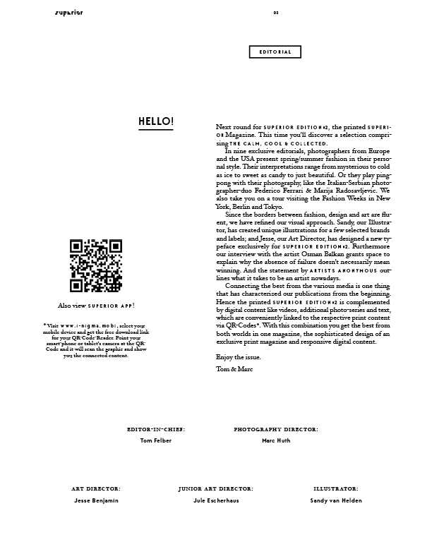
for developing my first typeface I wanted to create a geometric typeface that posesses the advantages of such fonts but is more ‘robust', especially in the caps, than for example Futura.

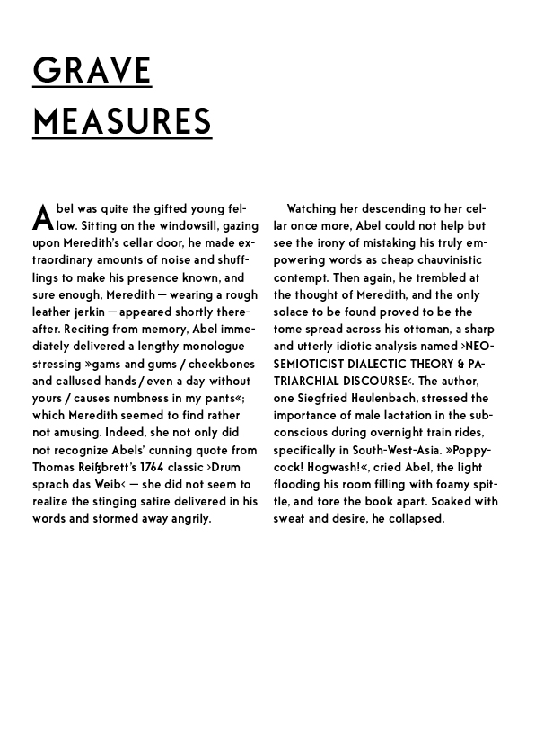
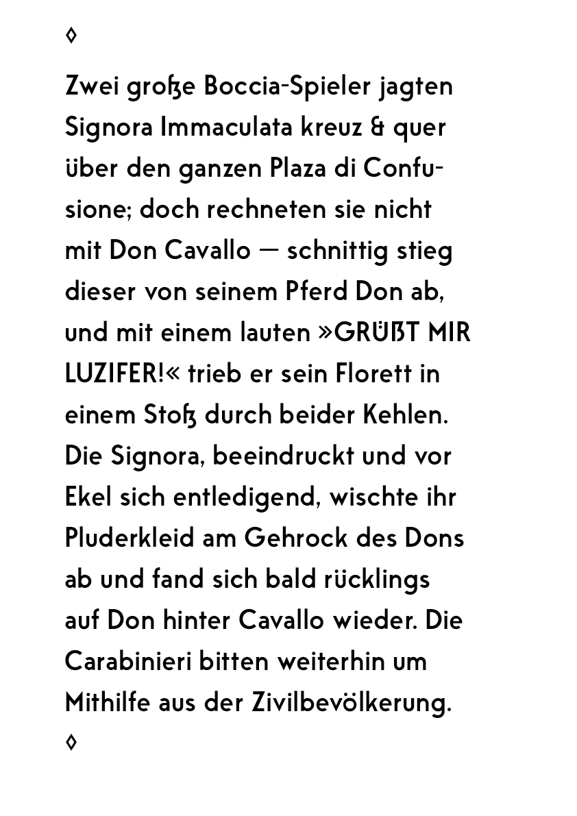
Currently I am working on spacing my first complete draft. I don't want to presume full capability for continous text with this font-style, but a test to see if the glyphs relate nicely to each other was more of a pleasant surprise than I thought:


I know that especially the upper-case S, K, W and Y and lower-case s and y are still very shaky. I would really appreciate overall and specific critique.
Thanks,
Jesse
P.S.: I will be working on a Book-style too.