
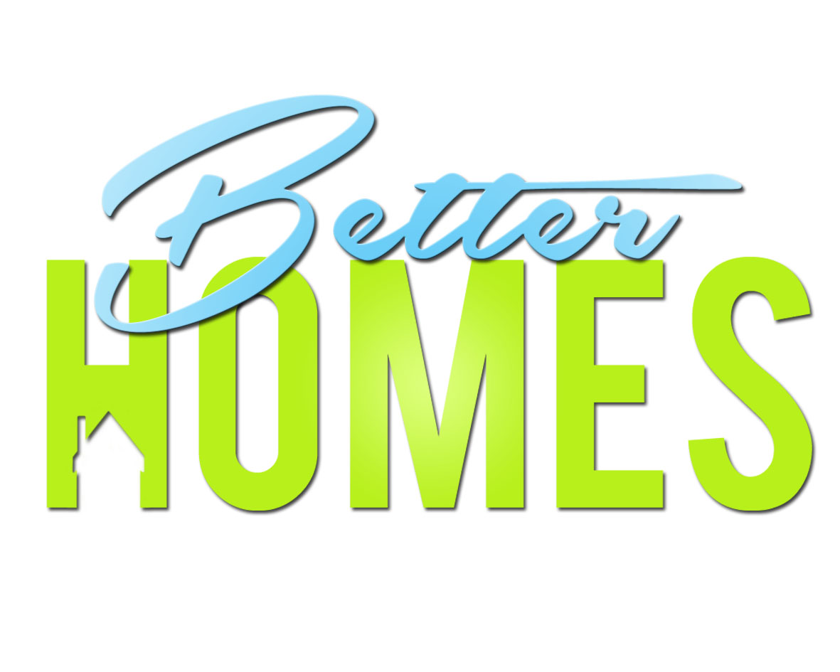
Can you please give me feedback on this logo.
This will be a new modern property company. It will mostly attract people from 18 to 28 year old.
Thanks
| Attachment | Size |
|---|---|
| betterhomeslogo1b.jpg | 122.21 KB |
Can you please give me feedback on this logo.
This will be a new modern property company. It will mostly attract people from 18 to 28 year old.
Thanks
| Attachment | Size |
|---|---|
| betterhomeslogo1b.jpg | 122.21 KB |

From a mechanics standpoint, at most sizes, the cutout in the 'H' is going to become undecipherable and look more like a malformed 'H'.
Agree with aluminum. Look what happens when the logo is small:

Can you give me some ideas please
> Can you give me some ideas please
Kyle, you might want to consider hiring a professional graphic designer to develop your logo, stationery, website, signage and marketing materials. It would be money well spent.
But if you're looking for an idea for your existing concept, one approach would be to make the house icon large and put the type inside of it.

the best thinking on logos i've come across is by paul rand. http://www.paul-rand.com/foundation/thoughts/#articles
this isn't a brush off. anyone designing a logo should read those articles.
the best thinking on logos i've come across is by paul rand. http://www.paul-rand.com/foundation/thoughts/#articles
this isn't a brush off. anyone designing a logo should read those articles.
Captured from web.archive.org on 19 Aug 2013. view this capture
