
Can you identify this one? It could be a custom work.
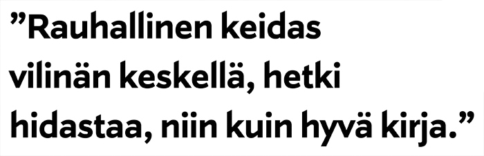
Can you identify this one? It could be a custom work.

Looks like the love child of Interstate and Scala… : )
That's what I thought, with that 25 degree terminals, but that forced angl edegree coupled with 'n', 'h', 'u' etc. makes me wonder.

What's the sample origin? Could be easier to dig.
It's a Finnish department store, Stockmann, and that is their new advertising typeface. It has at least three weights, but I've not seen any italics.

Methinks that something is rotten in the state of Denmark…er, Finland…

This PDF says Stockmann Sans.
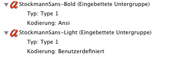
Good catch, Renko! Wasn't able to find any good one yesterday night. So, definitely corporate typeface called Stockmann Sans. If I have a little time, I'd try to find some more information on this one.
Captured from web.archive.org on 21 Apr 2015. view this capture