
A while ago I released a typeface based on Unicorns, which found it's way into some weird places I never expected (think about yearbooks for heavily Christian school communities) Of course you can still find the font, including the horn-less sans and rainbow numerals here.
Now I was thinking: What could improve this? I actually was thinking of a new series of Unicorns since the last one wasn't that well-drawn. But there had to be more! So I thought: What could be better than Unicorns with Pegasus wings?
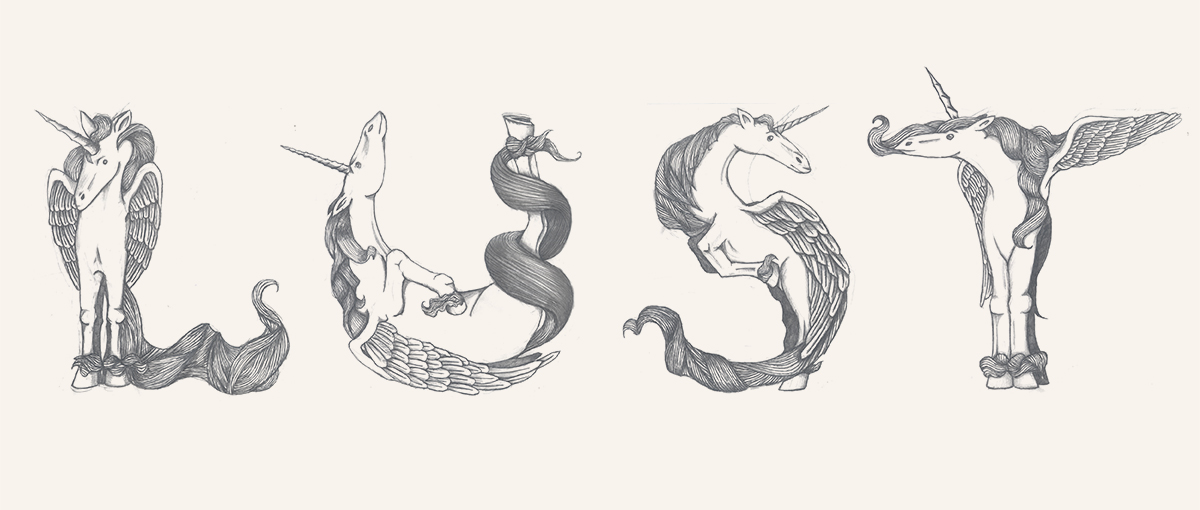
Now I'm slowly finishing all the caps now, which will still require some work. I won't be vectorizing them, but they will of course need a good cleanup. They are meant as initials, but they should of course work just as well when placed next to each other.
Bitmaps aside, are there any good ways to implement these? I'm afraid I will be stuck with placable psd's (or transperant png's), making my main target group (sadly MS Word users) (almost) unable to use them.
Idea's would be welcome!


