
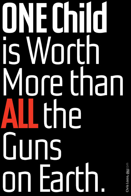

I’d be curious to see a version where the other words aren’t capitalized (downstyle).
ONE child
is worth
more than
ALL the
guns on earth.
Are you a fan of JMB?
Who is JMB?
JMB ;)
I certainly am.
Yes, I am a fan of that JMB but surely not the OTHER one that I found when I googled the initials. A certain Mr J.M. Browning, the inventor of the automatic rifle.
What do you think about lowercase on your poster?
I guess I see why you mentioned JMB. He was a very big fan of all lower case as were many of his contemporaries. A friend of mine, Peter Megert apprenticed under him years ago. Peter wrote everything in lower case. I find it to be a bit of a modernist's affectation in the 21st century. I opted for no descenders to tighten the leading to a painful level.
While I can see how the lowercase of everything except ONE and ALL can help pose the dichotomy a bit stronger, I don't feel it would be any better a solution.
@Christopher: Your suggestion is growing on me. Here is a revised version.
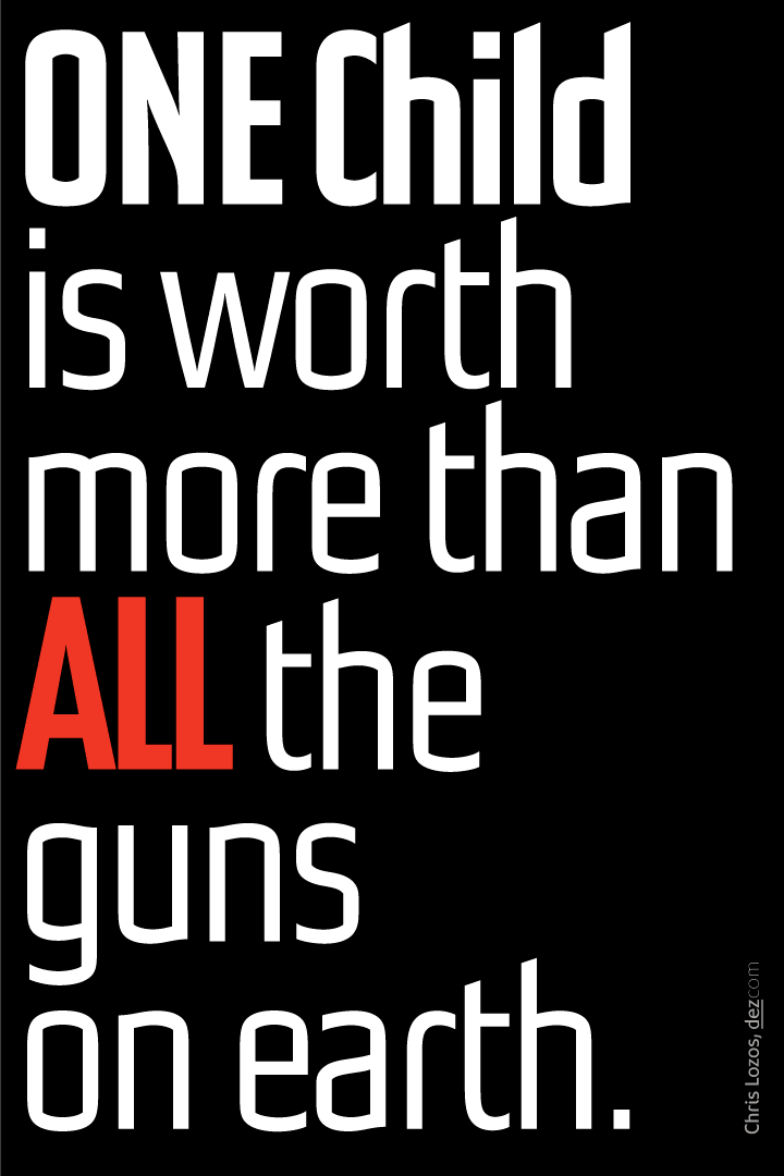
I think the capital C in Child competes with the capitalization of ONE. In terms of visual rhetoric, one could also argue that all lowercase letters appears more youthful. I do however see why you may wish to capitalize Child as a proper noun. Conversely, with just ONE and ALL in caps, the eye will quickly isolate and compare those two words.
With just ONE and ALL in capital letters, a singular touch of red, and a lowercase c, you may not even need to use bold to establish hierarchy.
A round period may elude to the planet earth? Tough call. May conflict with the other tittles (linked just in case someone joins in who doesn’t know that word yet), but seeing as there are two of them — child and is — and only one period, in addition to the proximity of the period to the word earth the reader will most certainly, consciously or subconsciously, be able to determine that the use of a round period was clearly intended to be a rhetorical graphic device, and not just a poorly designed period.
Have you thought about including the name of the typeface on the poster? Possibly instead of your own?
Alignment of small type with the outer stroke of the n in than?
Hrm. Design without clients. That’s worth meditating on.

That's a nice font Dez.
And here I was thinking that JMB was referring to the Radiant Child.
n.
I’m quite fond of the capital N.
@Christopher:
My initial concept of this poster included an exclamation point instead of a period with the globe being the dot and the upright being a gun site looking straight at you. All of these little attempts seemed to trivialize the message and take away from the dichotomy. I did, however, make one with only the period being round and ocean blue but not oversized. This looks okay as well since it does not detract and is still typographic.
As far as capital C goes, it has nothing to do with proper noun, it is there for emphasis and to tie ONE stronger to Child so that it speaks "ONE CHILD" more than "ONE child" with the "child" seeming to be of less importance. If I were concerned with proper nouns, I would have capped the word "Earth".
To me, proper punctuation according to a style manual is for editors doing more text than this. In a poster, you ave very few devices to work with and it is more important to have them speak more the intended message than reflect the dictates of Mssrs Strunk&White.
The small byline text is purposely only aligned at bottom. To align it at right with the "n" a few lines above would close that space and make the byline too active a participant in the structure.
@5Star:
Thanks for the complement. The typeface is called "Dez Headsup".
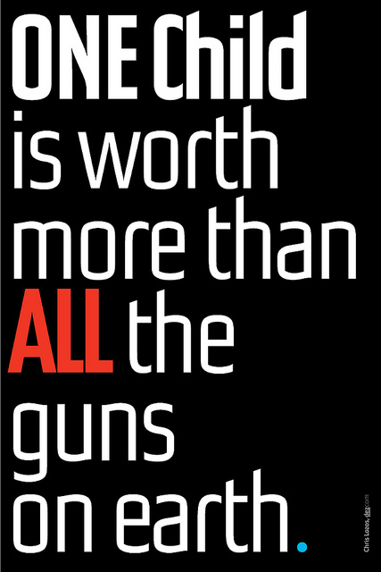
The round works for me, but I find incorporating a second colour significantly detracts from the use of red in ALL, undoing the gestalt principle of singularity.
What is the purpose of this design? Do you intend to print and sell posters?
@Christopher,
I just did the poster for myself and as a way of promoting stricter gun laws. I sent it to various political action groups and to my congress people here in Virginia.
I frequently do posters which I write and design--my way of avoiding clients ;-). I have a bunch more on my Flickr site. http://www.flickr.com/photos/dezcom/sets/72157626216163820/
I am only getting one printed for myself which will be part of an art show I am having in March.
"the gestalt principle of singularity" sounds better than it works. So many academic ventures in defining principles of human communication have no basis other than entertaining dialogue. You sound like a lost Ulm student but you are much too young ;-)
Good call. Strong influence, once removed. One of the founders of the design department at NSCAD University was a student of University of Stuttgart IUP Ulm and worked with Max Bill.
Thank you for sharing that link. Now I see how silly a question about your fondness of JMB’s work must have seemed. I hope you did now take offence!
Do you have details about your show you can share?
Christopher,
You asked about my coming exhibition, here is a link to the announcement:
http://typophile.com/node/101121
You should tweet this (unless I missed it).
It seems my poster just went viral:
https://www.facebook.com/photo.php?fbid=10151370822406275&set=a.18047998...
Wow! Are you going to print and sell them?
If I were to sell them, it would only be if the money went to victims of gun violence.
Even better. Definitely worth putting on the wall. If you were to follow the donation path, would you still entertain selling them? I think you should regardless. And sooner rather than later (strike while the iron is hot).
I just received an email from the "Rebuild The Dream" organization telling me that my poster is being used in a nationwide email campaign to get people to call their congress people in support of gun control.

Way to go Chris!

Nice coup.
hhp
Captured from web.archive.org on 14 Apr 2015. view this capture