
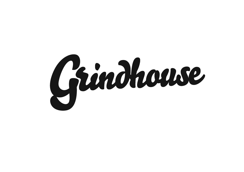
Hi This is a logo for a coffee shop - well OK it's just a typeface really (Bello) can I get peoples thoughts on the kerning? The 'G' is causing me particular consternation...
Thanks
| Attachment | Size |
|---|---|
| grindhouse_logo.pdf | 110.13 KB |
Hi This is a logo for a coffee shop - well OK it's just a typeface really (Bello) can I get peoples thoughts on the kerning? The 'G' is causing me particular consternation...
Thanks
| Attachment | Size |
|---|---|
| grindhouse_logo.pdf | 110.13 KB |

There's an alternate 'G' in Bello Script (at Unicode 0122, gcommaaccent) that would fit better. The short leading stroke on the subsequent 'r' is awkward to deal with, but can be moved closer to the alternate G. I tried connecting the G to the r, unaesthetically!
The gcommaaccent alternate would have to be modfied to remove the accent; for some reason that's the ONLY glyph with that alternate 'G'
- Herb

I would amputate the “entry” stroke of /r.
But can’t you modify this wordmark in some conceptual manner to make it really special?
Nick above said exactly what I would chip in to this. You usually need to sort out the lowercase 'r' for script typefaces, plus any other connections that don't actually connect. But really you want to also alter something to make it more unique and 'say' more about the brand.
Thanks all. Had an issue with the relationship between the d and h, which we've resolved by creating a ligature. Also made the G bigger which allowed us to move the r in closer and make it more like a vapour which adds the character - it is for a coffee shop after all.
Still a work in progress but hopefully this is moving in the right direction. What do you think?

That "dh" conjoined twin action is pretty bad. :-/
It might work to make them "hug" the way "Gr" is hugging.
I would also try unjoining the bottom of the "G".
hhp
Thanks again. The bottom of the G opened up looked a bit odd to my eye. However agree the conjoining was awkward - perhaps the rhythm of the other joins was throwing it out? Anyway do you think this is an improvement?
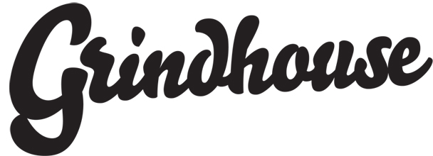
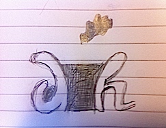
Strictly speaking, if you’re being true to the inherent calligraphic ductus of this style, the d should join the h at the top, e.g:
Captured from web.archive.org on 19 Aug 2013. view this capture