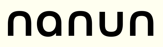
I am working on a logo(type), I'm using Futura Medium for this, all lower case.
The name has a 'u' and an 'n', so during sketching I tried to rotate the 'u' 180 degrees and use that as an 'n', less clutter because the 'n' has this slightly 'ascending' stem on the left while the 'u' is like an upper case 'U'.
Now this looks good imo, only thing... since there's also an 'a' in the name, the 'a' would be the only character left with a slightly 'descending' and 'ascending' stem (right).
Is this weird? being inconsistant?
I mean the original font seems to be inconsistent too because the 'u' looks like an upper case 'U' still I'm not sure if I can leave the 'a' as is.
I hope I'm clear lol, can't post the logotype.
Thanks.