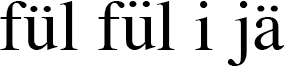
Hi! I'm a pupil at a German school in Portugal, and speak several languages. I mostly write texts for homework in languages which make use of many diacritics, like Portuguese, German, French, Swedish. My favourite font is Quiosco (http://www.fontbureau.com/media/images/specimen/characters/quiosco/quios...) . I'm looking for alternatives to this font, with some of these characteristics: 1. All accents should be very visible. In Times New Roman, for example, the accent on the small i is very hard to distinguish from the normal dot. Accents play a very important rôle in Portuguese: início=beginning, inicio=I start - cágado=turtle, cagado=shit. 2. The circumflex accent ^ should be large and visible, as it is in Quiosco. In most fonts I've seen, it is too close to the letter, too small, or too thin. 3. The trema ¨ should be at exactly the same hight as the i-dot. 4. The ordinal indicator º ª should be underlined (as in Quiosco), because this is part of the orthographic traditions in Portuguese. 5. The ß is a German letter used whenever a s is pronounced like ss, but follows a long vowel. It was created by a ligature, either between the long s (ſ) and the old z (which looked something like this ʒ), or between ſ and s. So in modern typography there are these two versions: http://upload.wikimedia.org/wikipedia/commons/5/52/ß_in_Arial_%2B_Helvetica.png . As the letter in German is called Esszett (sz), I'm prefer fonts which use that version. That's what happens in Quiosco, where, on top of that, there is a small stroke on the left side of the letter, resembling the appearance of the ſ in some fonts. 6. The font should be serif. Thank you for your help.