Hi all,
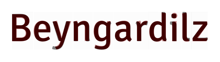
I'm working on a logo design where the client wants the word to be all uppercase: it's an acronym. The word includes an uppercase I, and I suspect that the logotype will be friendlier to read if I dot it.
I don't want to identify the name of the client here, but it's similar to SPRITE.
For the uppercase I, I'm echoing the lowercase i's design while keeping the weight of the uppers.
I need your expert opinions: Where's the best place to put the dot ... above the cap height, or down a bit with the I shorter than the other caps? Any rules of thumb?
Many thanks,
Dave