Typophile

Anje Sans

jancharvat

Hello typophiles. I'm watching this discussions for a while and now decided to put my very first typeface here.

I've started with type design and this typeface on Summer workshop Tipobrda 2012 in Slovenia. It went through many changes and ideas, many times thrown in trash, many times totaly redesigned. I would like to stop at some point and do the rest of the design process. Still I'm not sure about this stage it and that's why I'm posting it here.

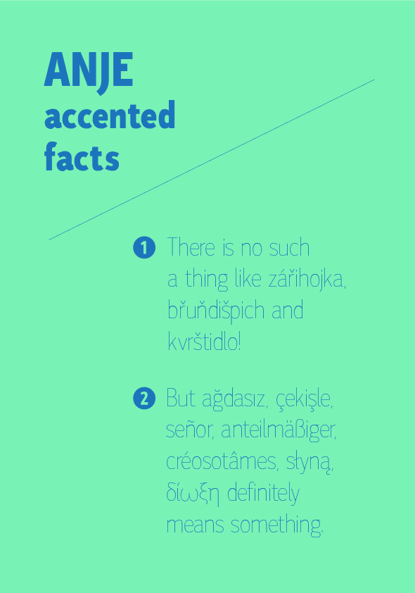
Here is simple latin alphabet. Texts, diacritics and greek are in attachments. Also I put there one older stage of design.

I'll be very gratefull for any comments and especialy critique.

Anje Hairline:

Anje ExtraBold:

AttachmentSize
test130130.pdf458.68 KB
test130103.pdf443.35 KB
dabelsky rosol-01.png33.35 KB
facts-04.png29.82 KB

Admirable! Something bothers me about the extrabold w, though. I don't object to the basic structure; I think it's that the second stroke seems to have a mismatched slope. Capital W doesn't have this problem, but the way the top of the middle stroke flares from (or tapers toward) the join may be conspicuous.

It's nice. I think the caps may be too condensed, and you need to make a decision about the height of crossbars. I'd go for optically centred in E, F and H, and (maybe) just slightly higher in P and R.

I think the crossbars work with this and help keep it from being redundant. I might just slightly lower the crossbar of E, and I mean very slightly.

Thank you for your finds. I can see the trouble with /w now. The thing with proportions bothers me from beginning. On the first sketches they were even more narrow. But then I was unable to match the lowercase with them. I'll try make uppercase bit wider. Is there any common connection between capitals and lowercase in terms of proportions?

Thanks Jan

I agree with Dave, I think a firm and clear decision needs to be made whether the crossbars are to be "normal" or "eccentric." Right now hairline /E/F/H/ look much more stylized than hairline /A/, and also more than any of the corresponding extrabold letters.

I've bee thinking whole afternoon about the crossbar thing and came up wih two solutions. At first I tried to apply more eccentric style to every crossbar, but there I was tightend with xtrabold cut, so it hasn't moved so much further. Then I made visually centered one. In comparision the eccentric one is more distractious then the normal one. What do you think is better?


more text here:
http://jancharvat.cz/projects/type design/own/anje/data/crossbartest1.jpg
http://jancharvat.cz/projects/type design/own/anje/data/crossbartest2.jpg

In the begining there was some idea of making a font it with few differences. After nearly half a year they all dissappeared. Now looking backward I can see they were probably in most cases inappropriate. But I'm bit worried it's falling to ordinary, booring box of fonts...

Thank you for your time.
Jan

The "eccentric" heights are more interesting.

I still feel like in the extrabold only the /F/ and /H/ read as correspondingly eccentric. Can you lower /A/ and raise /E/ more? It may also help to lengthen the middle arm of /E/ (and /F/) in that heavier weight.

eliason: You're right, definitely more interesting. When it isn't in comparision, I think it's not distracting at all. I tried also to add more contrast to bold lowercase and changed uppercase M and G. Here it goes:

more texts:
http://jancharvat.cz/projects/type%20design/own/anje/data/test130203.pdf

Captured from web.archive.org on 14 Apr 2015. view this capture