
| Attachment | Size |
|---|---|
| Detect.jpg | 252.02 KB |
| Attachment | Size |
|---|---|
| Detect.jpg | 252.02 KB |

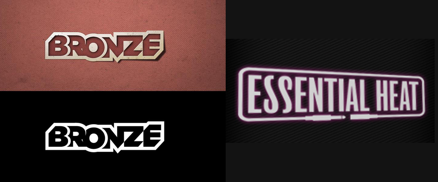
Can be wrong but to me, it's rather a custom logo design than a font as it. You can start for instance with any black generic sans like Akzidenz Grotesk (to get such /R with a straight leg), Helvetica (wrong /R) or Neue Haas Grotesk (right /R as alternate), vectorize the all thing, move letters up and down, make some cuts and work on connections.
Captured from web.archive.org on 17 Oct 2013. view this capture
