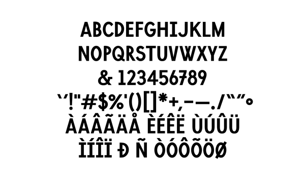
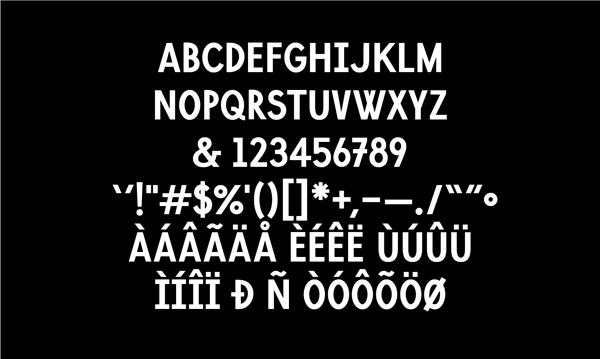
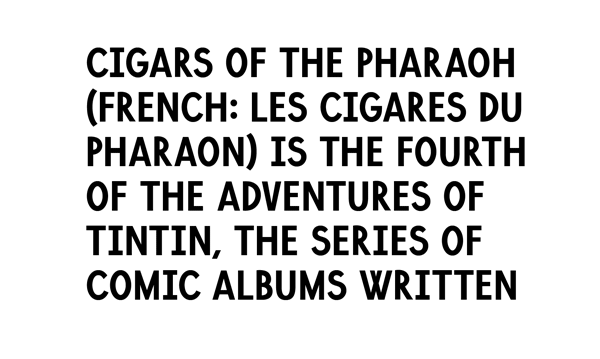
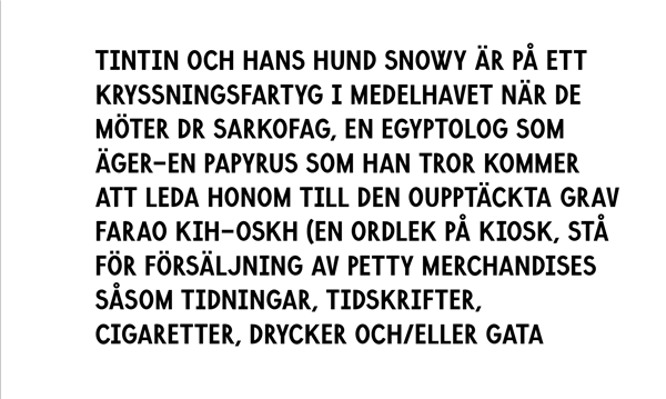
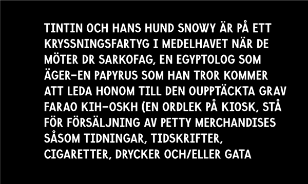
Hello Typophiles, its been a while since I have posted on here.
This is the first time I have seriously tried to design a font, I'm 20 and a student, previously I have flirted half-heartedly or edited existing faces. So I would really appreciate some feedback (please be gentle, this is my first time at the rodeo).
The working title for this font is Lombard, but I have a feeling I am going to change it. I was inspired by a pair of unique street signs in my home town of Wellington, but through further development I found myself looking at the type used in the Tintin magazines of my childhood. I can also definitively say Colophone's incredible Raisonne and Grilli Type's entire catalogue were guiding hands as to the boundaries between feature and distraction.
I am placing this post in the Display section, for obvious reasons. I position this as an interesting alternative to the many condensed slabs that people use perhaps a little too often these days.
Overall I'm quite happy with the result, but I know that there is a fair amount of work left to do; small caps, a lighter weight and perhaps an outlined version is in order I think.
Please let me know what you think, dying to hear.