Hello,
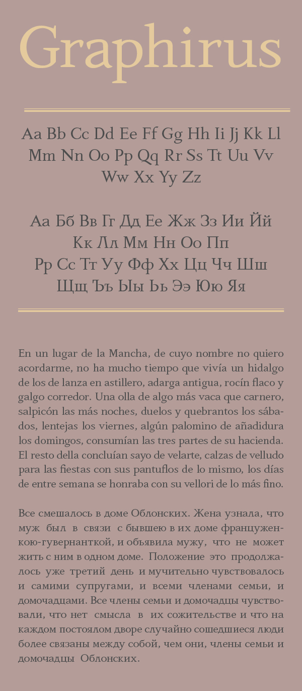
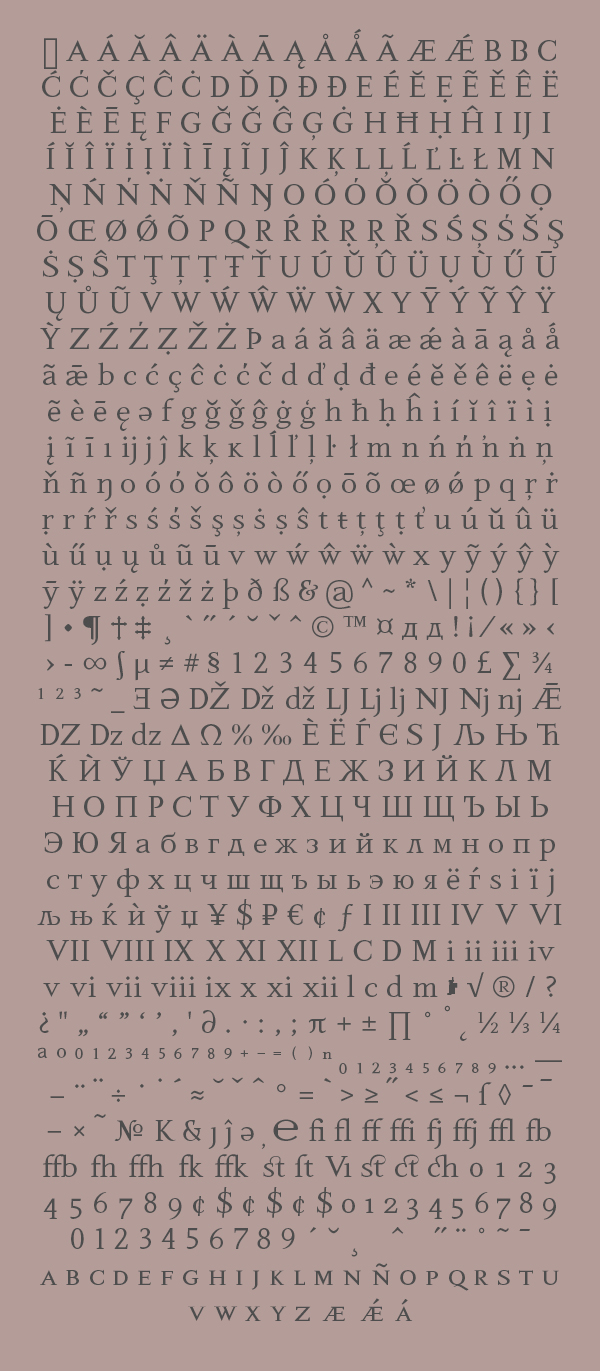
I'm almost done with the basic shapes of my new font and I'm tweaking bits here and there balancing everything. Still haven't decided yet on the style of the serifs and probably some characters will change... for example I'm seriously considering a trapezoidal Д instead of the triangular one I currently have, I don't like al the white space around it.
Please comment, critique, suggest.
Thanks